Ed. Note
The article below was written in 2019. Currently we are deep in the UX/UI redesign work of the Citizen OS platform which will be expected to be finalised in 2022 and launched in 2023.
Introduction
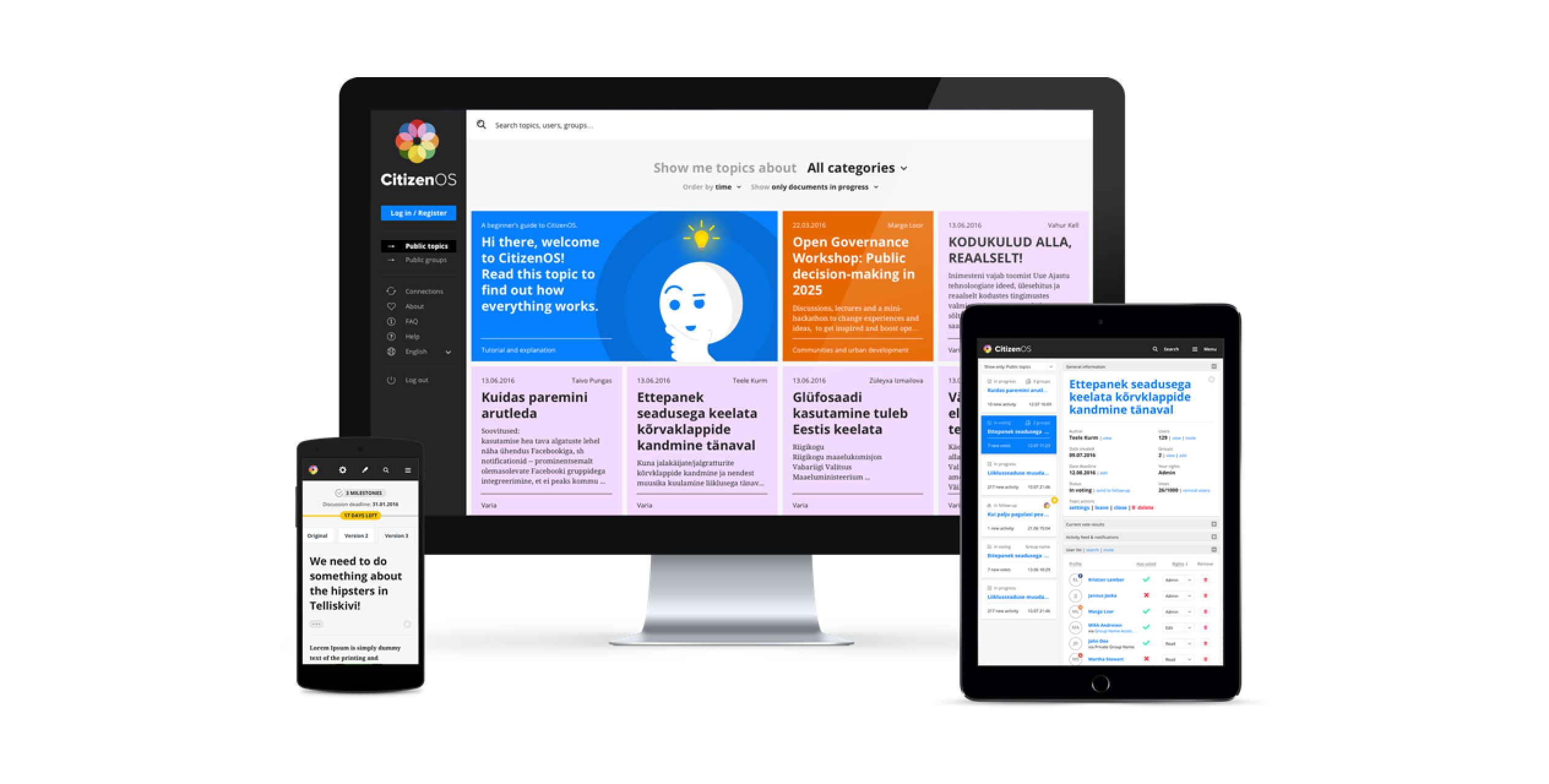
Citizen OS is a social enterprise raising awareness on participatory democracy. Its digital platform — which bears the same name — is used as the main tool for explaining what participatory democracy actually means. The platform enables users not only to create and edit documents of any size, but also allows for others to collaborate on them. After discussion (with pro and con arguments), a voting phase can be created in which the decisions or statements within the document may be reinforced by real people’s votes. In this way, the platform facilitates accommodation to especially those organisations or companies which have a hard time getting people in the same room to vote on certain issues.
There’s probably no one better to explain this than the people at Citizen OS themselves, so check out the video for a quick explanation.
A long-term cooperation
Citizen OS and DUX go back a while. We were first approached in August 2014 and we have been collaborating ever since. As designers, it is very important for us to be in it for the long run. We don’t want to merely design something, ship it and never look back. We believe that businesses and products change over time, and that their design needs will likely change as well. So, for us to have had the chance to be involved with Citizen OS from the very start of their product’s lifecycle was ideal.
In the meantime, the platform itself has seen one major redesign in 2016, and the organisation‘s website also went through a redesign which went live in 2018. But that doesn’t mean our work is over. Since Citizen OS grows as both a product and an enterprise, we continuously make improvements and changes. Some features have been in the works since the very beginning, others pop up as the platform’s usage spreads across the world and into different cultures.
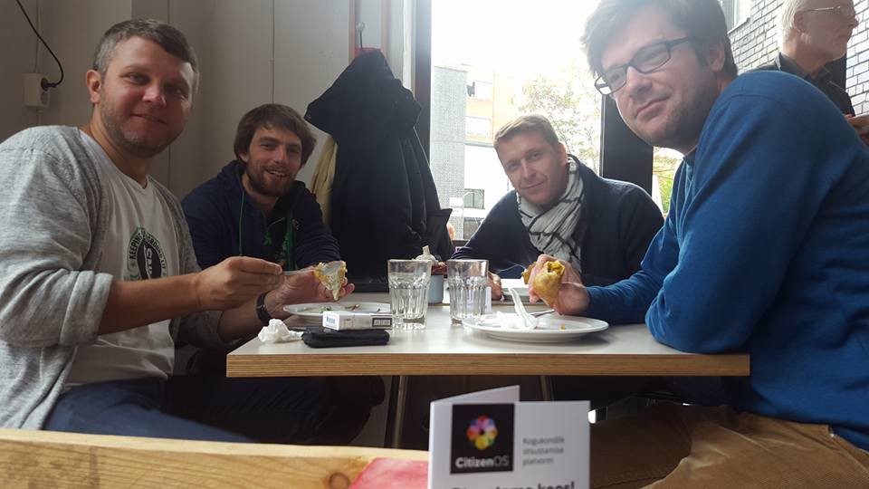 Snapshot at the launch of Citizen OS Platform — from left to right: Kristian Lember (DUX), Mikk Andresen (Tiblu), Jannus Jaska (Pulse) and Kevin Crepin (DUX).
Despite the fact that we’ve started work 5 years ago, and that redesigns have been implemented in the meantime, the core design ideas still endure in the platform’s current state. That’s probably because the very early stages of the design process are what define the eventual outcome. And we do not skip those stages.
The DUX design process
How we approached the start of the platform design (and later the website’s design) was very much how we are still approaching design today: we have a meeting/workshop with the client to map out the business and the ideas in order for us to properly understand the ins and outs. Then we list down all requirements from both the business’ and user’s end. After this, we have an ideation phase on how the platform’s UI could work. During this phase, we consider different aspects like usability and scalability, while also thinking of new, interesting ways how an interface like this could work. We discuss with our team the best approach, followed by scribbling and making sketches on whiteboards. When we get to a place we like, and we believe will work, we move on to wireframes.
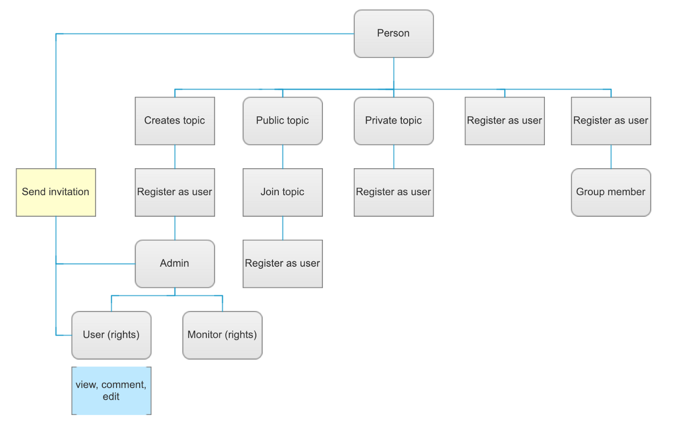 Some quick initial user flows
During the wire-framing phase, we present our initial ideas to the client and re-open the discussion. At this point, we are more interested in getting all the required functionalities and flows right, rather than having a final layout in place already. This is the time where we iterate a lot and drag every single missing piece of information out of the client. It’s a phase we never skip, however big or small the design project is.
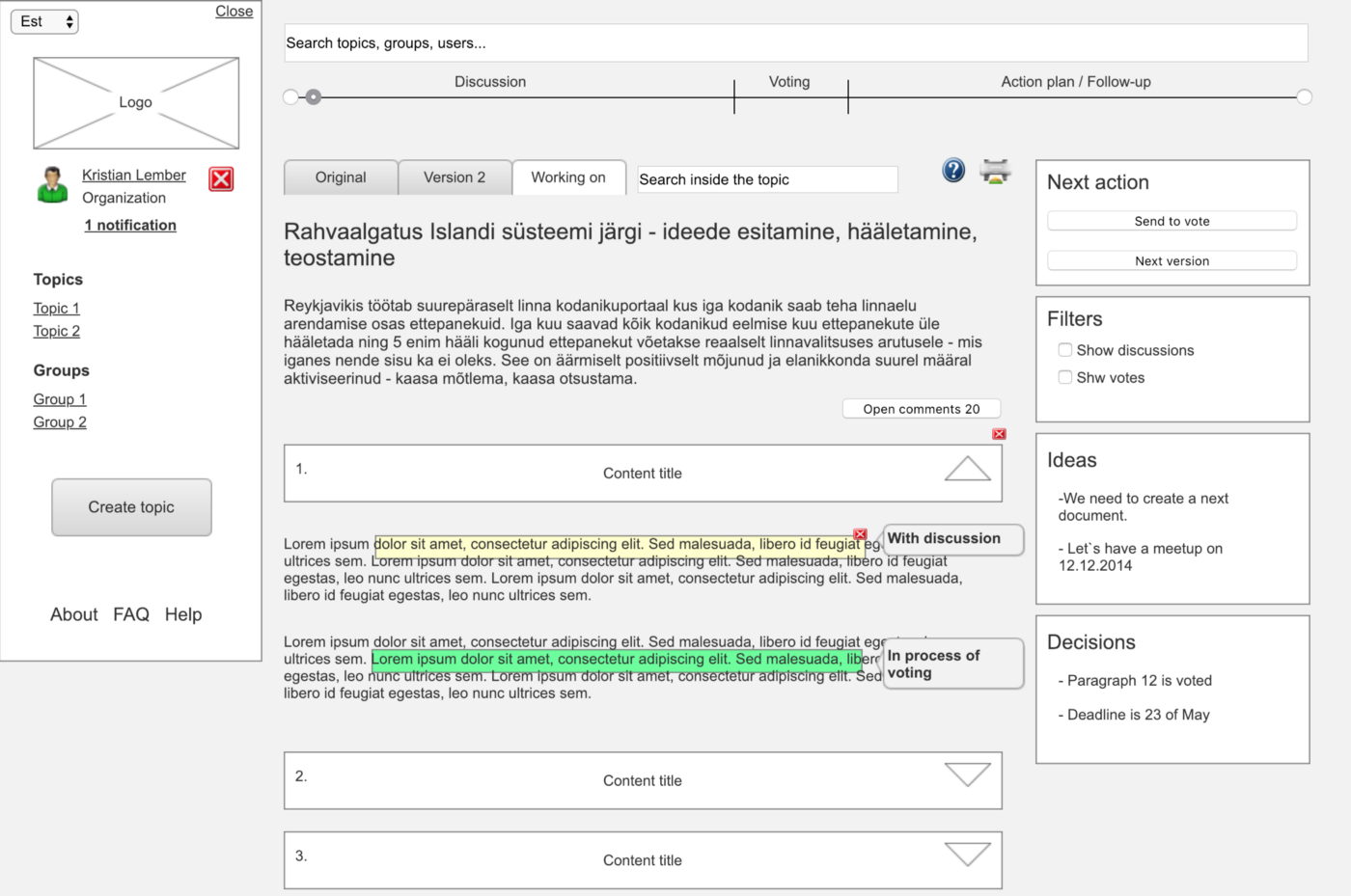 Early wireframing to put our thoughts onto the screen
When we move on to visual design, a lot has been said and done already, and for most clients this is when things get more understandable, thus also more subjective. However, in a case like Citizen OS, where the platform is solely the container of the message and not the message itself, it is far more important to have a neutral visual design language. Considering the need for scalability as well, we quickly agreed that the visual design should be functional and not stand-in-the-way.
Focusing on some platform UI elements
Let’s go into detail with a couple of UI elements. Some have been redesigned over time to better cater to the user’s needs after several feedback rounds. Others are features that we envisioned but which are still in progress.
Redesigning the dashboard
The dashboard was the primary focus of the 2016 redesign. It was clear early on that the representation of topics in the dashboard just didn’t scale very well. The users were engaging in many topics, but the overview was lost because of the bulky design of a topic within the dashboard. When redesigning, we took a page from how mail software is designed and determined whether it could fit in this context as well. There’s a list of topics on the left side, and selecting one opens up its details on the right side.
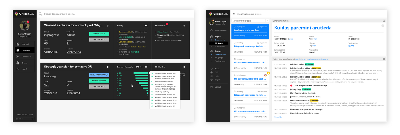 Old dashboard vs new dashboard
Creating a voting platform
One of the big benefits of Citizen OS is the fact that topics can be voted upon. For this we needed a robust system where the user can set up the voting mechanism that they require. This takes only 4 steps for the creator, after which the users can cast their vote. When the voting has ended, the creator can also download a digital document which holds the votes and user’s signatures (if voted with ID), which they can present to the deciding organisation, whether it’s a board or a government.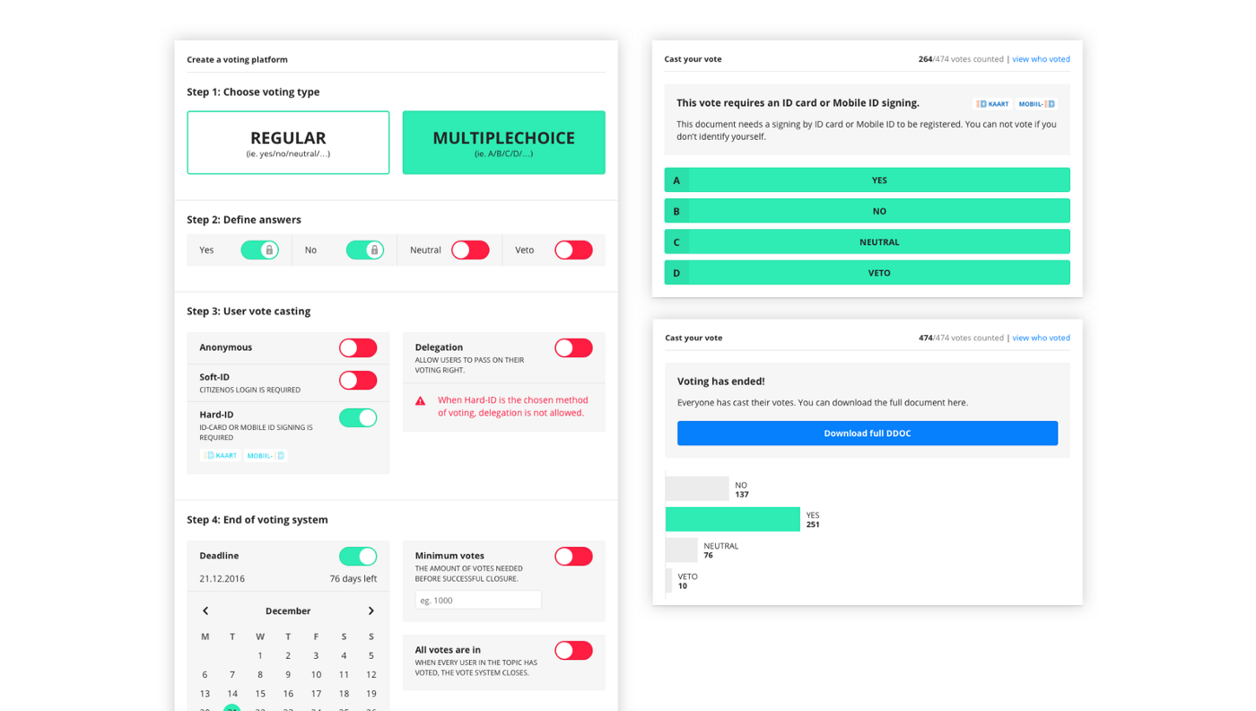 Voting system
Inline commenting
The possibility to interact with the document is a feature that presents some tough problems. How do you keep track of the interactions? Do we allow anyone to comment anywhere, edit anything? In a document that consists of several pages, how do you keep the overview?
We wanted to introduce a system of inline commenting where the user could highlight a part of a paragraph and start a discussion. This highlight would remain visible with an indication of how many comments were made so far. There couldn’t be another highlighted part within the original highlight–this “base” highlight would now be clickable to open up the comments. It is a feature that to this day is something we want to work out, so it could be tested in the real world. A light version of this feature currently exists, and our hopes are high for our vision to one day become reality. And then we can see whether it works or not!
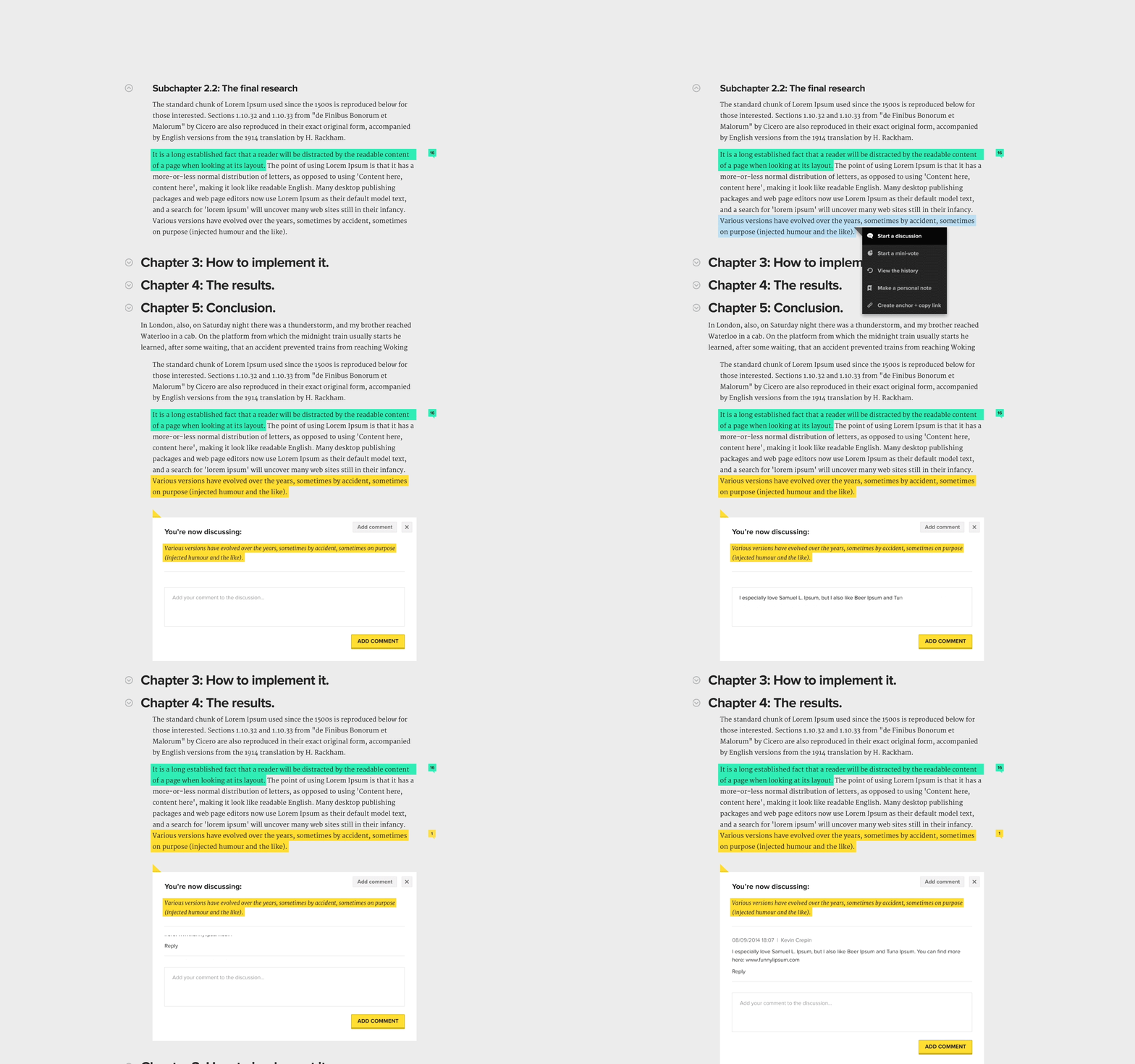 The commenting system — maybe some day?
Citizen OS as an organisation
So far we have talked mainly about the platform and this was the main focus for a long time. Consequently the Citizen OS website itself also reflected this same focus both in its message and from a visual point of view. After 5 years however, the organisation has grown and although a big focus is still on the platform, it isn’t the only aspect that needs to be communicated.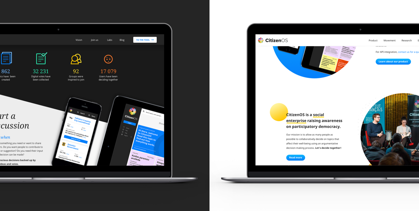 Old website vs new website
Citizen OS wants to educate about the benefits of participatory democracy and the platform is a tool with which it can do this, but it also organises conferences and uses research to help decide on solutions.
So in 2018 the Citizen OS team and DUX sat together to discuss a redesign of the website to reflect this change in message. At the same time we would also have a look of the visual language of the old website and improve on that. Whereas the old website leaned more toward a darker (tech) colour scheme, we wanted the new website to shift towards a lighter and more colourful colour scheme, with more photos of people and less screenshots of the platform: a more human/emotional design.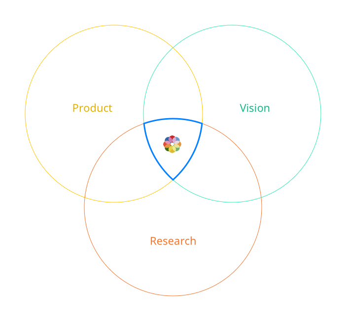
What the future holds
An organisation like Citizen OS is evolving all the time and its product is no different. As new people are joining their team and new organisations are joining the user base new requests and issues are coming up. We are in talks to create a bigger UX revision of the platform while we collect feedback and comments from the community.
In the meantime we help them out with ongoing smaller tasks on the background, always trying to improve the user experience.
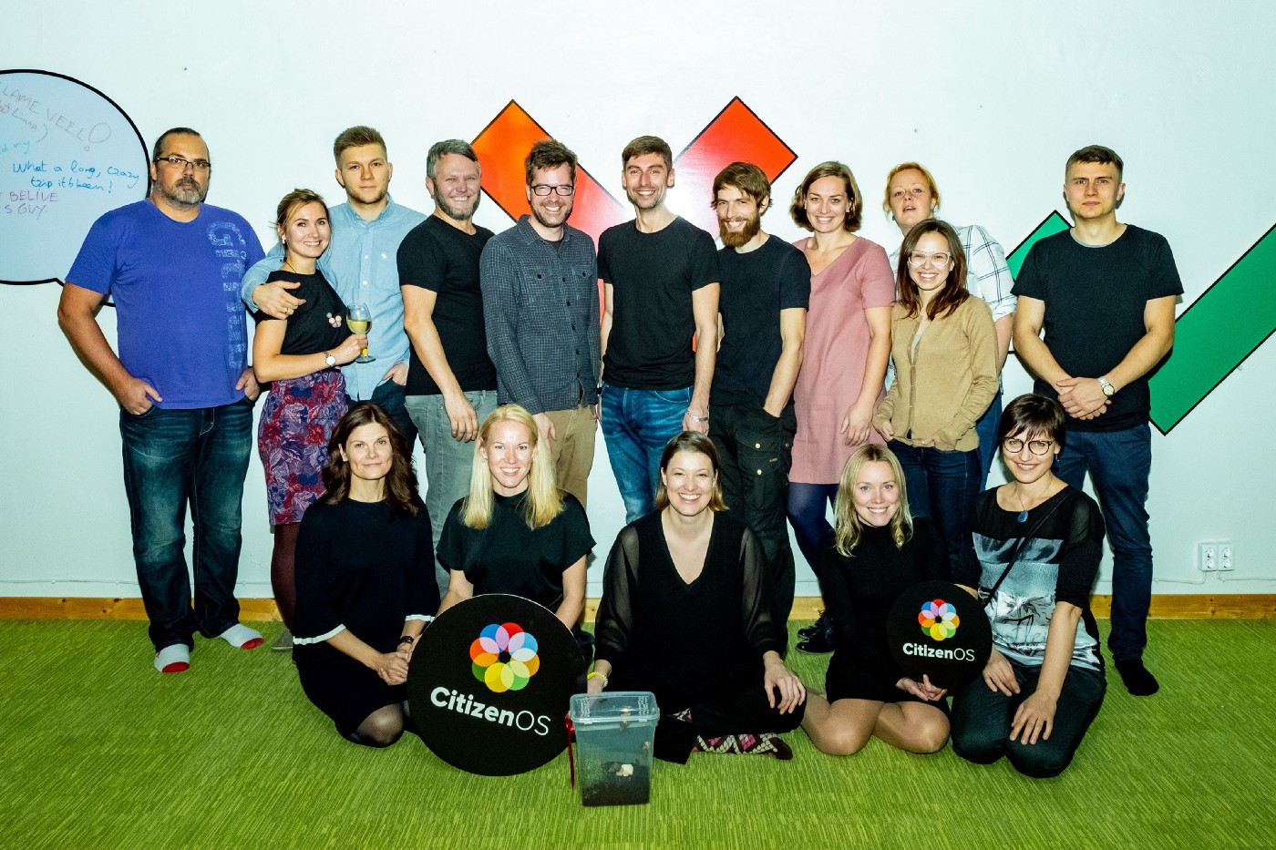 The expanded Citizen OS family
Cheers to the entire Citizen OS team for trusting DUX to help them with their design needs and collaborate for over 5 years. As a designer you want to be able to help create products that can improve people’s lives or make the world a better place in general. It’s an idealistic standpoint, but at least with Citizen OS we feel like we are reaching this idea.
