Year – 2017
Field – Telecommunications
Partners – Velvet Agency (research & ideation), Codeborne (dev)
Embracing constraints and creating a Next Gen TV experience
With a marketshare of 60% Starman has the biggest tv-watching userbase in Estonia. The use of a 3rd party user interface however meant that the old set-top-box was lacking in user experience, branding and general attractiveness. Users were all just watching TV, but wanting something more.
Working together with the client’s technical specialists, marketing, coders, designers and researchers, we set out on an almost 2-year journey to improve the user interface and introduce a couple new engaging new ways how to discover content. After Velvet did the user research and ideation, we were asked to join the project and design the user interface working closely together with software development agency Codeborne.
Several months after launch Starman merged with Elisa and we set out to rebrand the interface to fit within the Elisa product line-up.
Understanding today’s TV audience
Starting with the user research we interviewed key user groups, with a particular interest towards the groups that are not usually targeted by your garden-variety TV provider – the people who don’t have a TV (too hard) and the ones who watch way too much (too easy).
The key insight among users was that TV was considered a waste of time in a vast sea of content, you can never seem to find something to watch and even if you do, you watch the same thing over and over and over again. With younger audiences, the effect was even more drastic, they can find their content quickly everywhere else and are basically lost to the traditional, channel based TV industry. But we still need to keep the traditionalists happy.
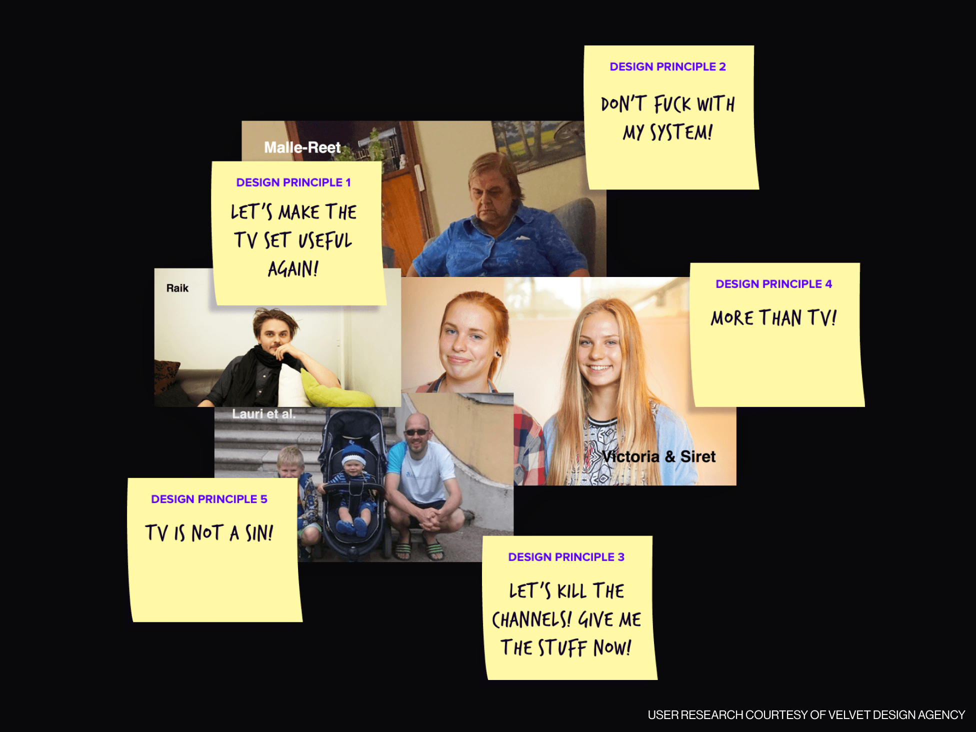
How far can you go to disrupt the TV experience?
We developed several concepts of for a more inclusive, less channel based and more activity or theme-based TV experience. We tried adding services that never belonged on the TV screen and removing things that have always been there, to understand how far or how lean can we go.
Understanding the platform
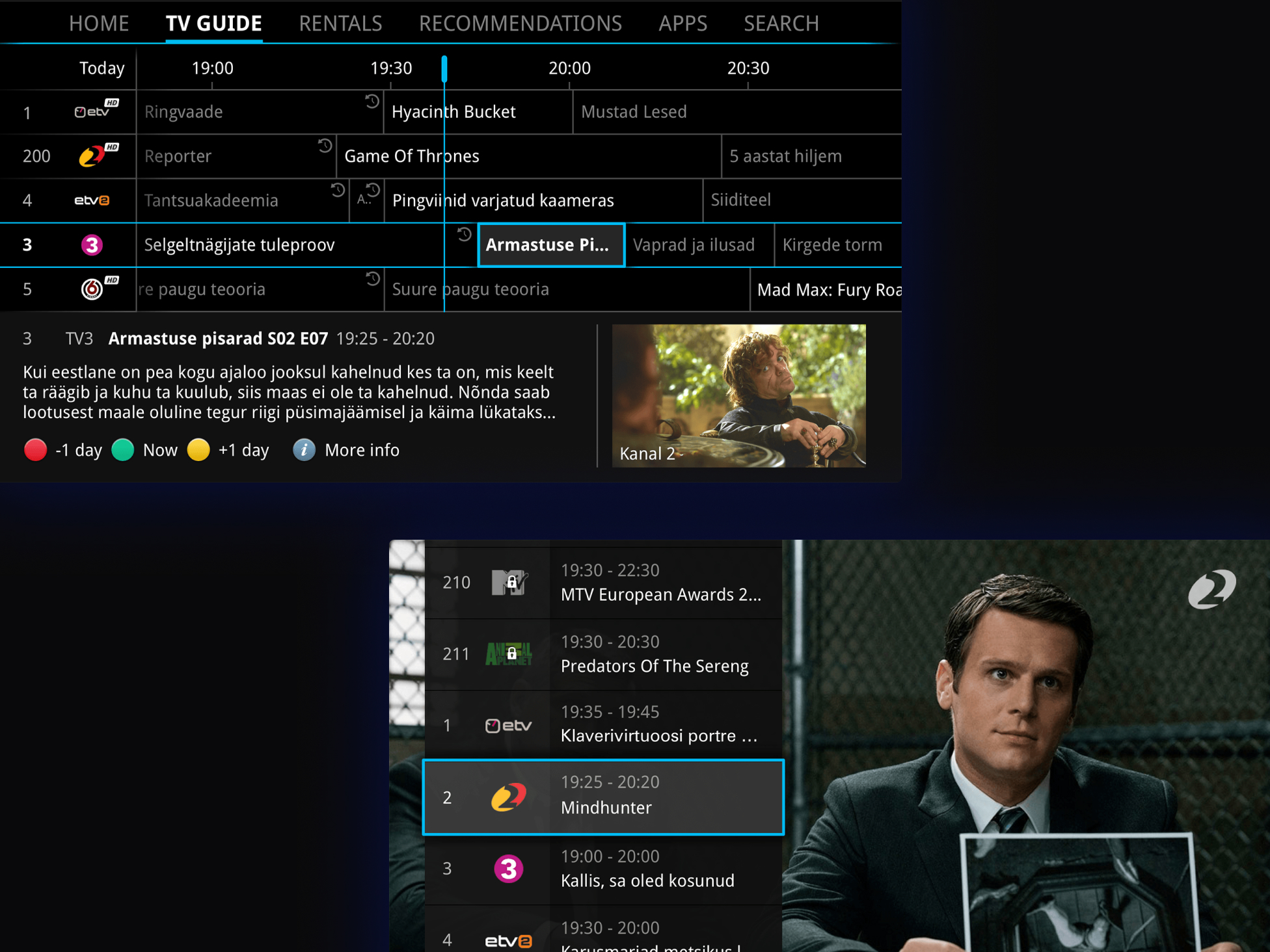
Designing an interface for TV means designing for a wide and varied audience with a preexisting knowledge of where to go to find things.
Understanding the existing interaction model was necessary to know what would be possible and what not.
Don’t mess with my system was the motto throughout the design process to ensure an easy transition for existing clients, improving where possible, but not complicating.
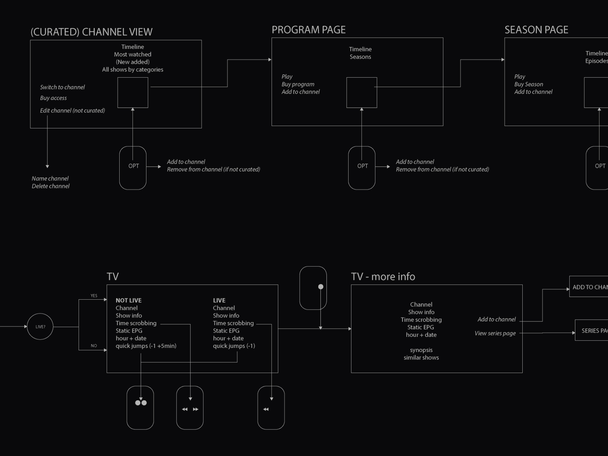
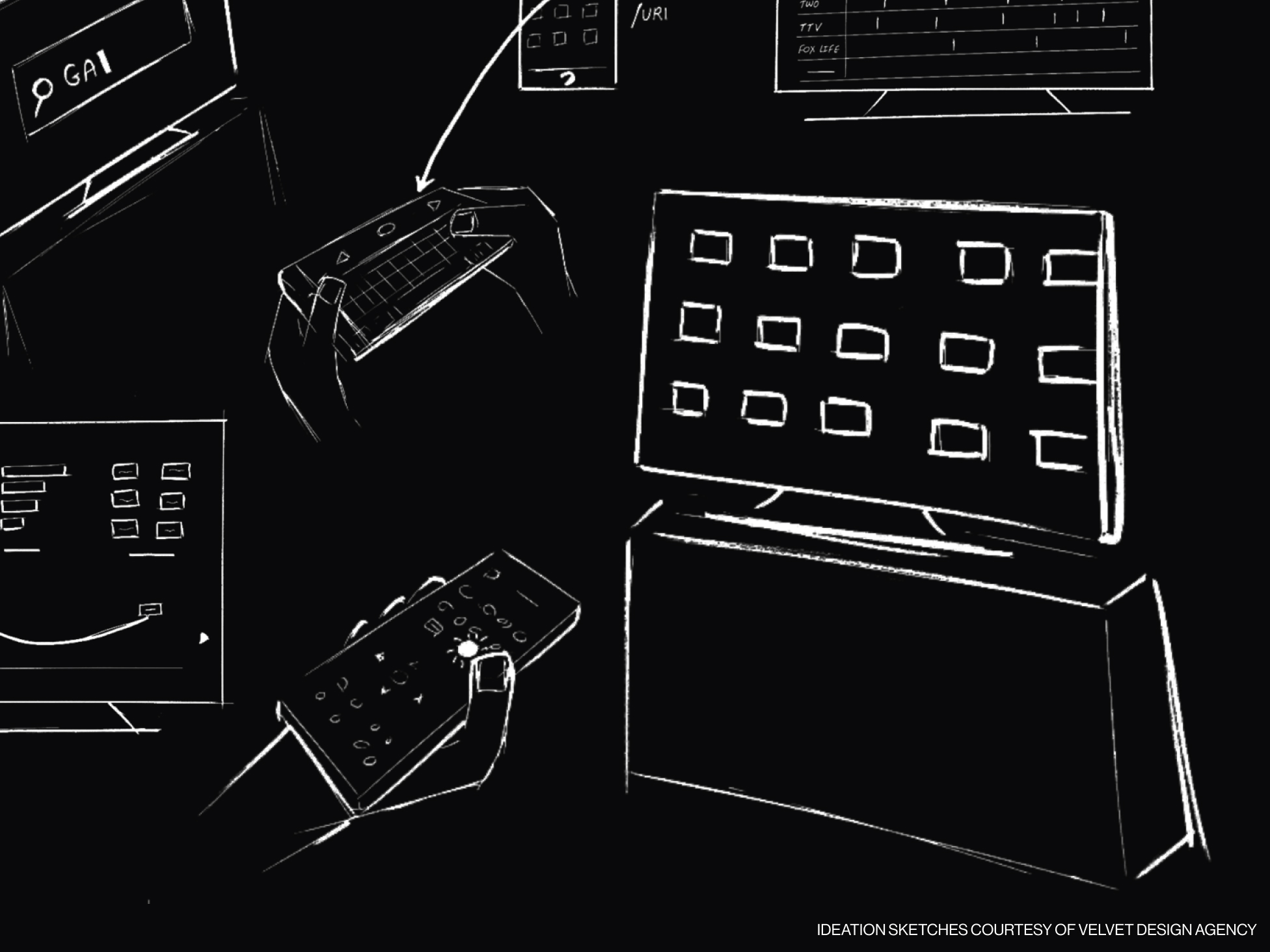
High fidelity prototyping & iterative process
Getting to the right interaction model meant iterating and testing out several versions. Weekly meetings with the client and the developers were happening throughout the entire process to ensure proper communication and follow-up from all sides.
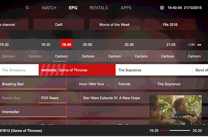
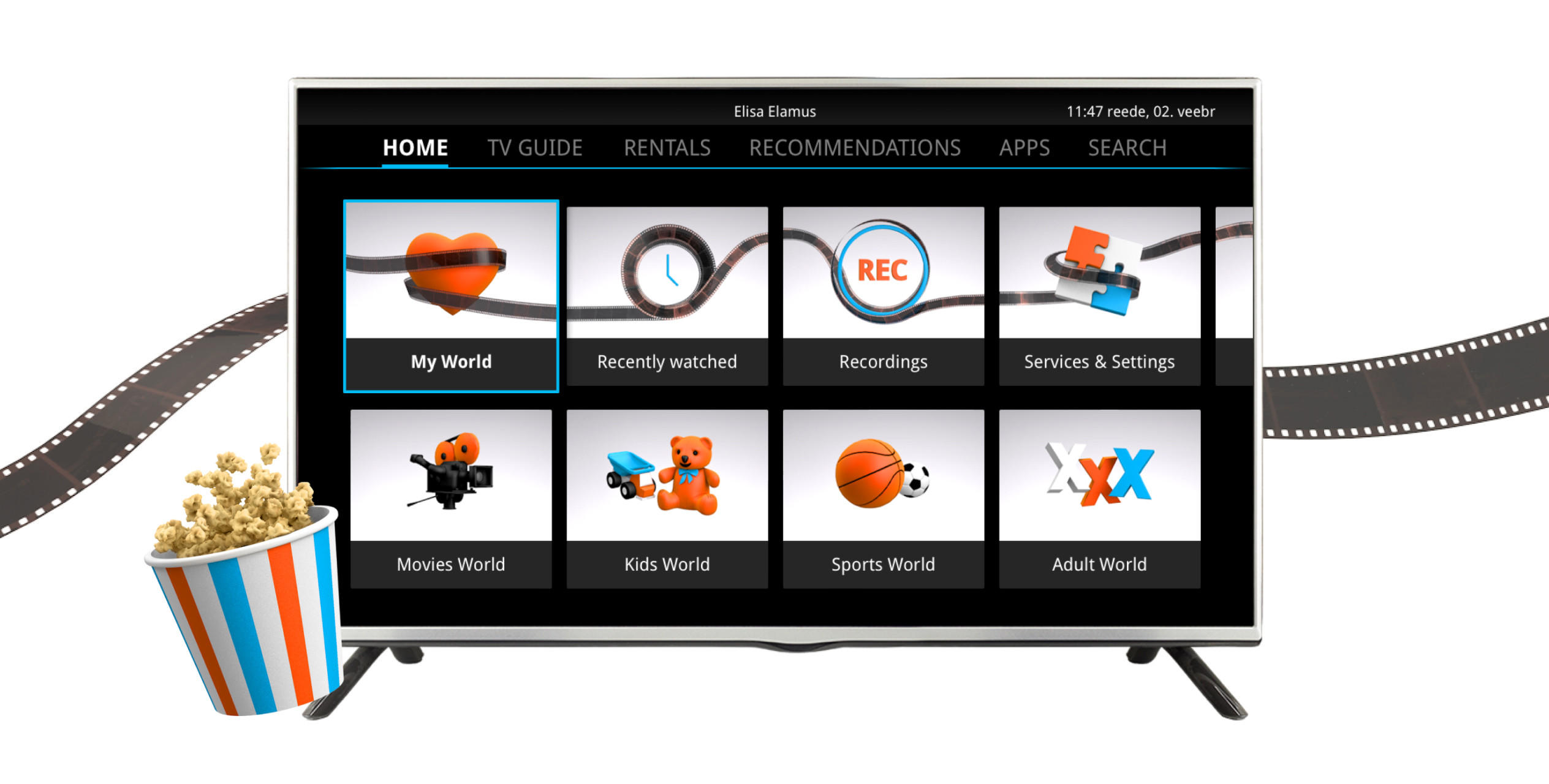
Visual design & identity
When designing for a TV we have to take into account the constraints a TV brings to the table. Title-safe area, dynamic contrast and readability at a larger distance are but a couple things to keep in mind.
While rebranding the visuals, we also revisited the folder images and fine-tuned them to be more clearly understandable. Using Elisa’s orange and blue colours, we created a fresh palette which is more engaging and dynamic than the old one-tone red.