Silen '2024
4 years after launching their previous site, the landscape for Silen had changed radically. They didn't have just one product line anymore, but five – and their international presence had grown exponentially. All this meant it was time to revise what they were communicating and to whom.
The DUX team, together with the help of additional partners, set out to reimagine Silen's visual communication and story. A story about creating peace-of-mind environments in a noise-filled world. A story about how SIlen is tackling workspace challenges with sustainable and adaptable spatial solutions that bring people together.
Goals & challenges
Silen wanted to make a big jump in growth which meant the brand and website had to reflect that and would be able to go toe to toe with any other big international brand. With global reach comes global competitition and one important aspect was for Silen to be able to have a unique spot in the landscape. To stand out amongst the others with a unique story and a unique visual approach.
Partners
ORGO – Development (website)
Häk – Development (configurator)
Villu Arak – Copywriting
Kevin "Mr. seQ" Devroo – Creative Visuals
Michael Payne – SEO
Visit
Awards
Golden Egg Awards 2025 – Gold
Estonian Design Awards 2024 – Gold
Research & interviews
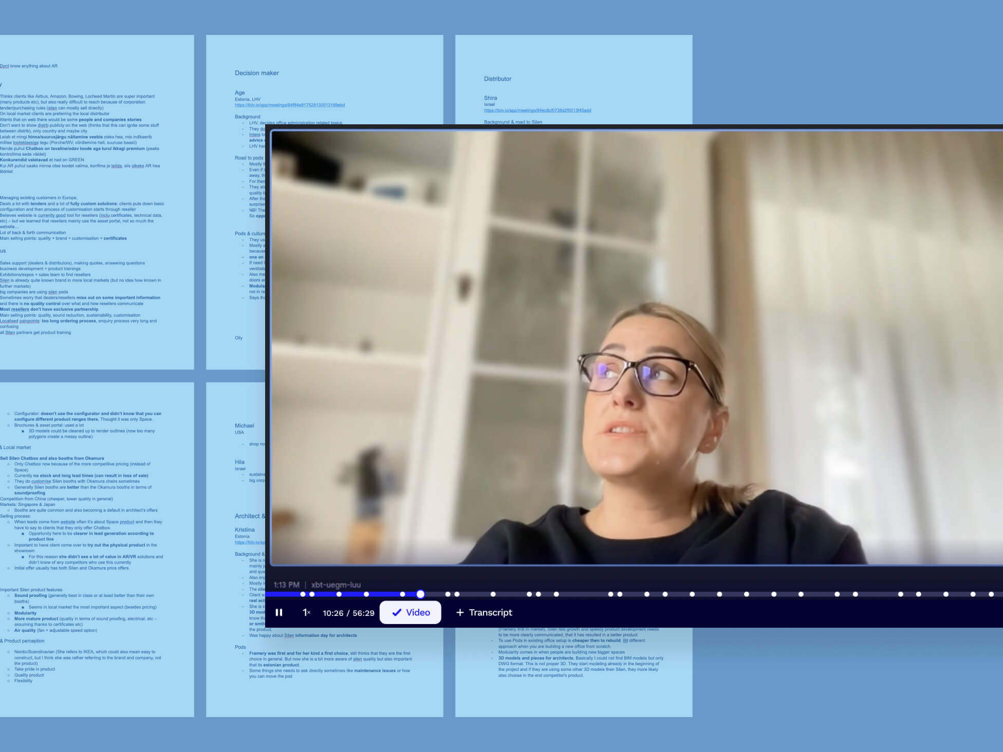
Before we could start defining a new approach we had to better understand how the brand (and its applications) was being perceived up to that point and what the painpoints were for business partners, like resellers, and customers.
We conducted users interviews with Silen's own employees, their partners and customers and did our own market and competitor research. By doing this we gained a much better understanding of the current "silent pod" landscape.
Expansive rebranding
The first focus for the rebranding was in the new brand story. We create a story that consists of 3 messages – each message speaks to a specific target user and is about how Silen's solutions make sense to them. For the end user Silen addresses the painpoint of noise and distractions while working. For the decision makers it's important to know that Silen's solutions are sustainable, dynamic and long lasting. And finally we look at how Silen designs for improved wellbeing in workspaces.
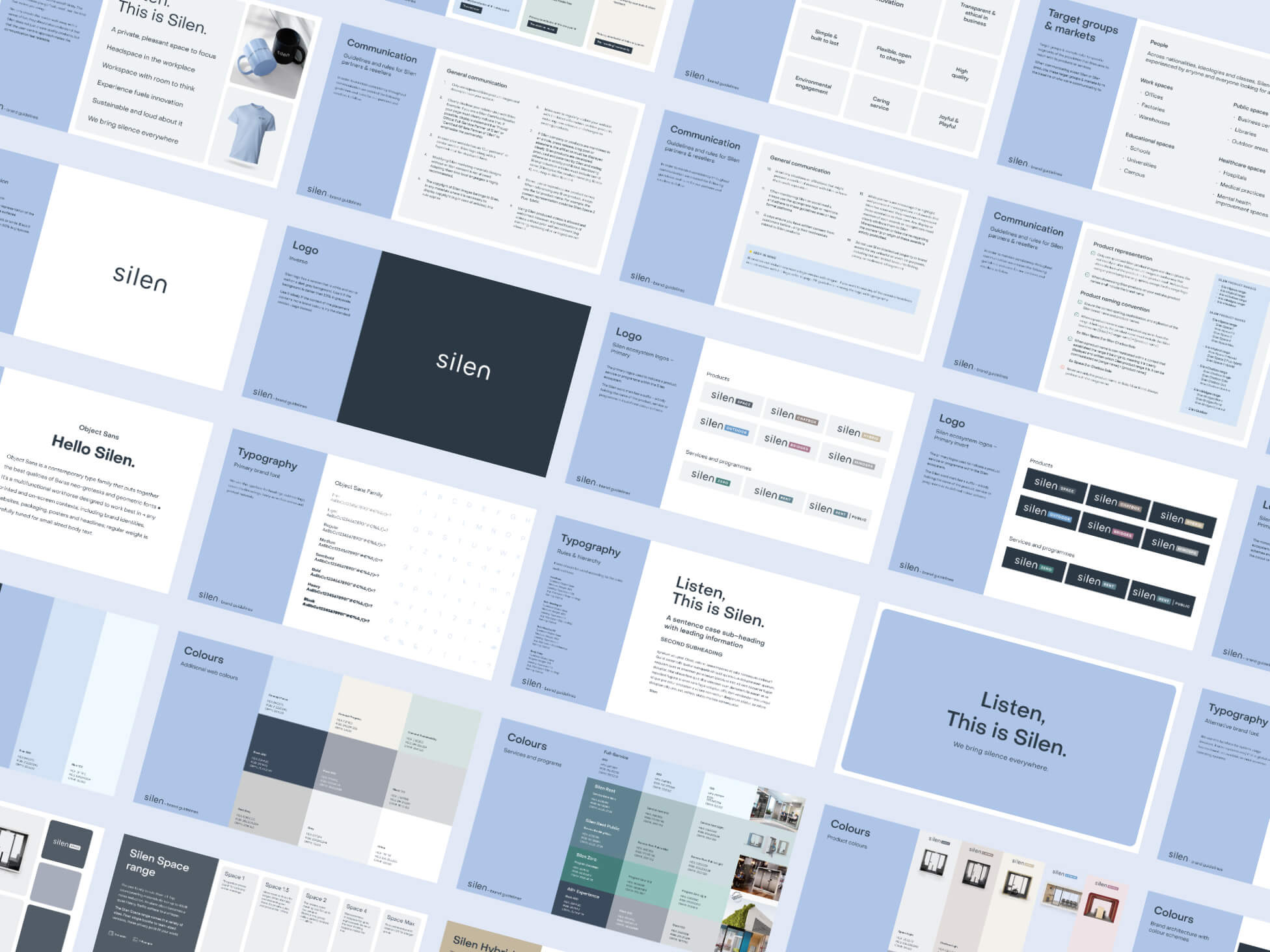
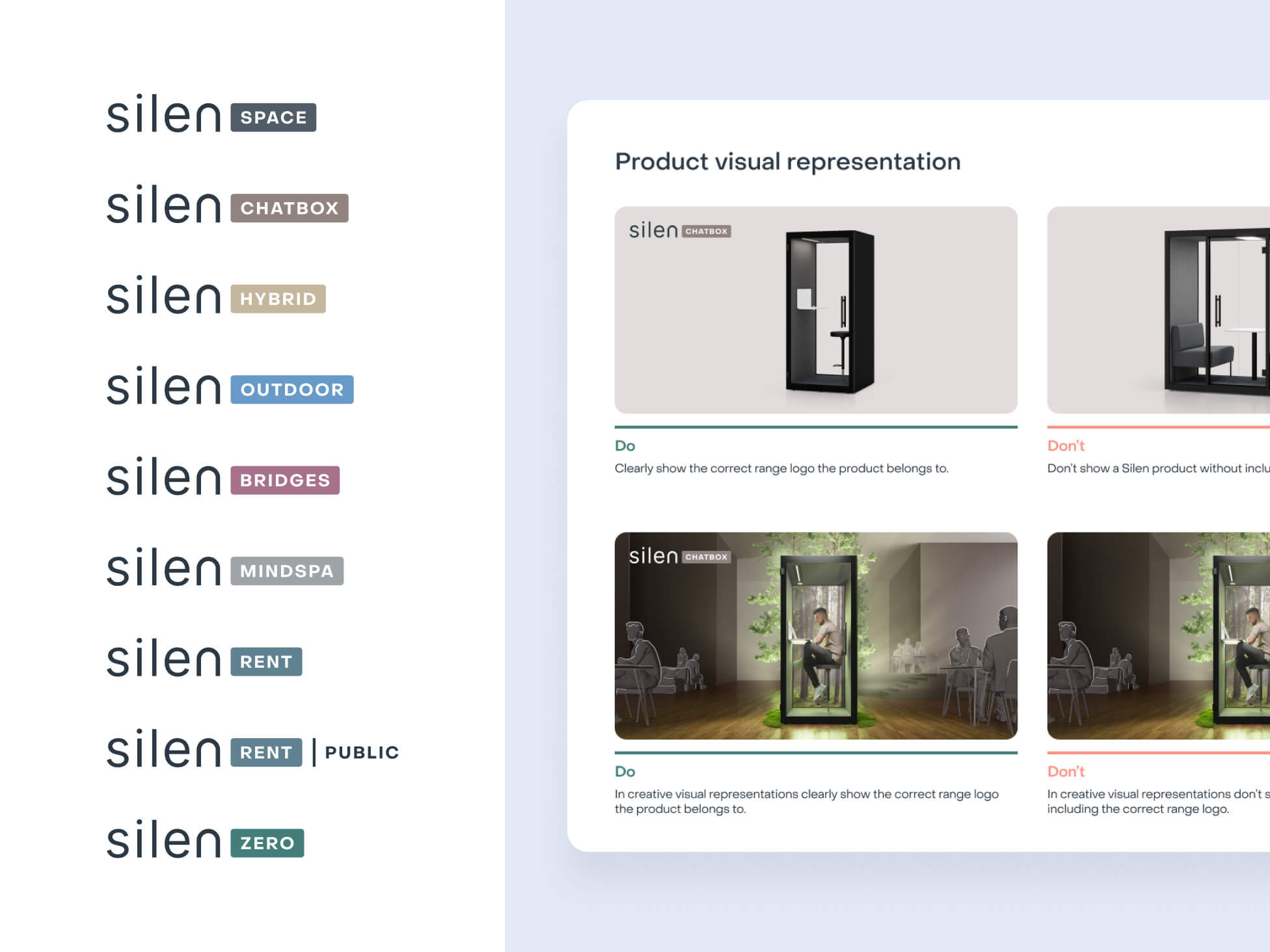
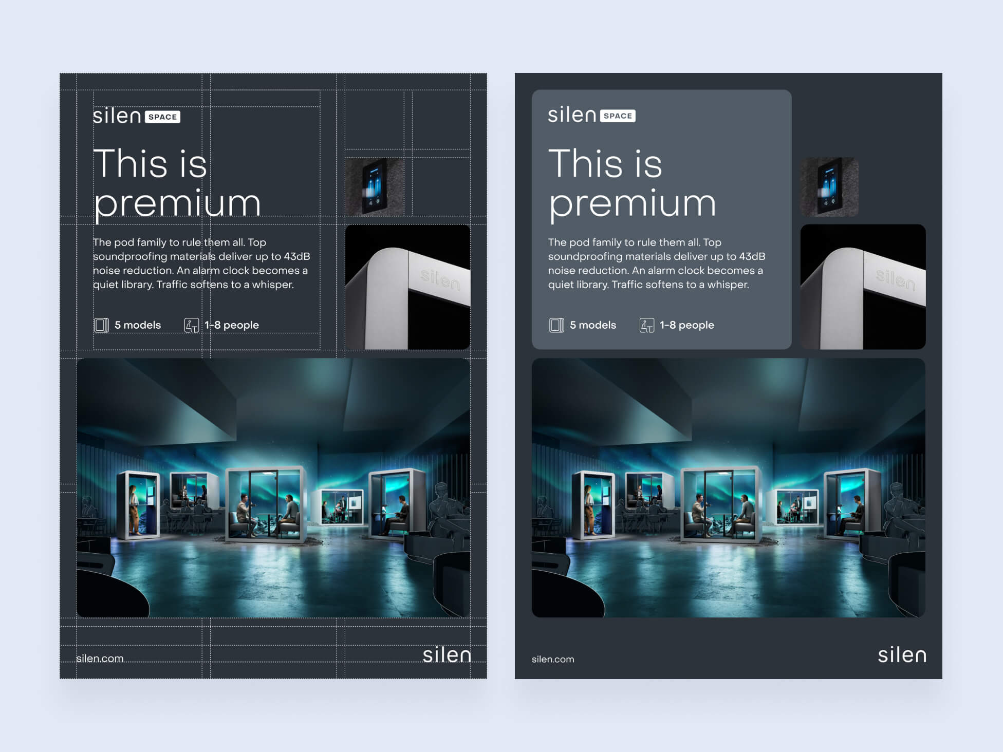
The second focus for the rebranding was to create new brand guidelines which define the entire Silen product and service family, set the communication rules more concretely and give more guidance as how to work with Silen's brand for partners.
A website with an "aha!" moment
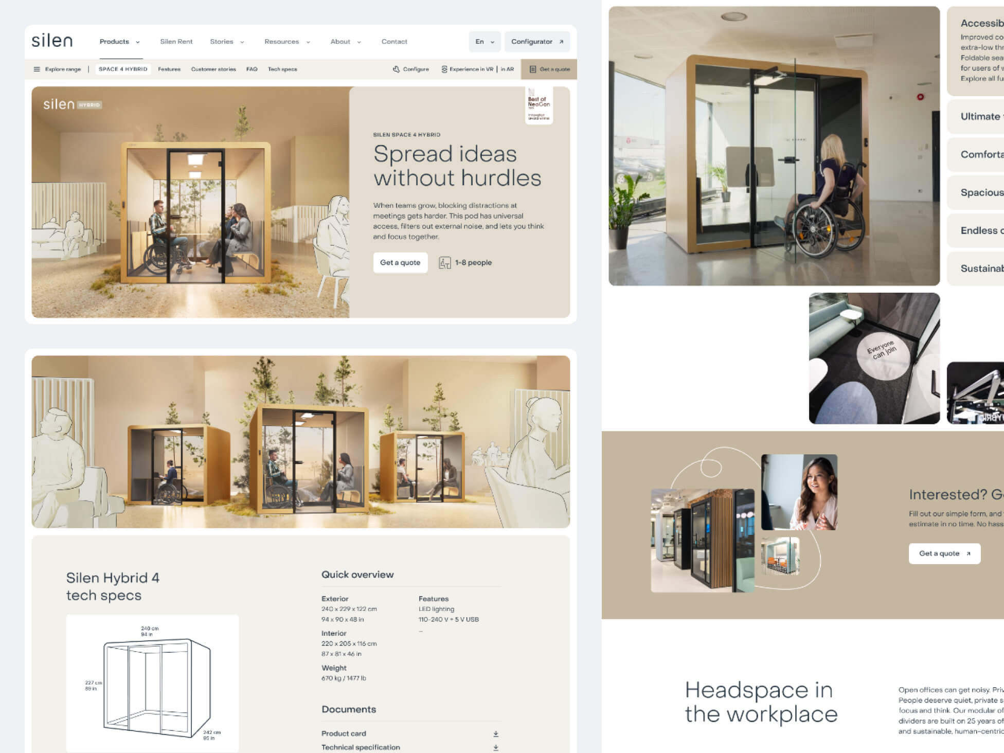
The entire website was rebuilt from scratch with a new media-rich and dynamic design. Showcasing the products with creative visuals, videos and photos was paramount in getting visitors excited about Silen's line-up.
But we didn't want to make a website like any other. Just how Silen wants to have a unique visual approach, we also wanted to inject the website with a unique touch. A little something that makes the user go "aha!" when scrolling through the content. The horizontal scrolling experience emphasizes the dynamic feature of Silen's products and creates a more memorable moment for the visitor.
Visualising peace-of-mind
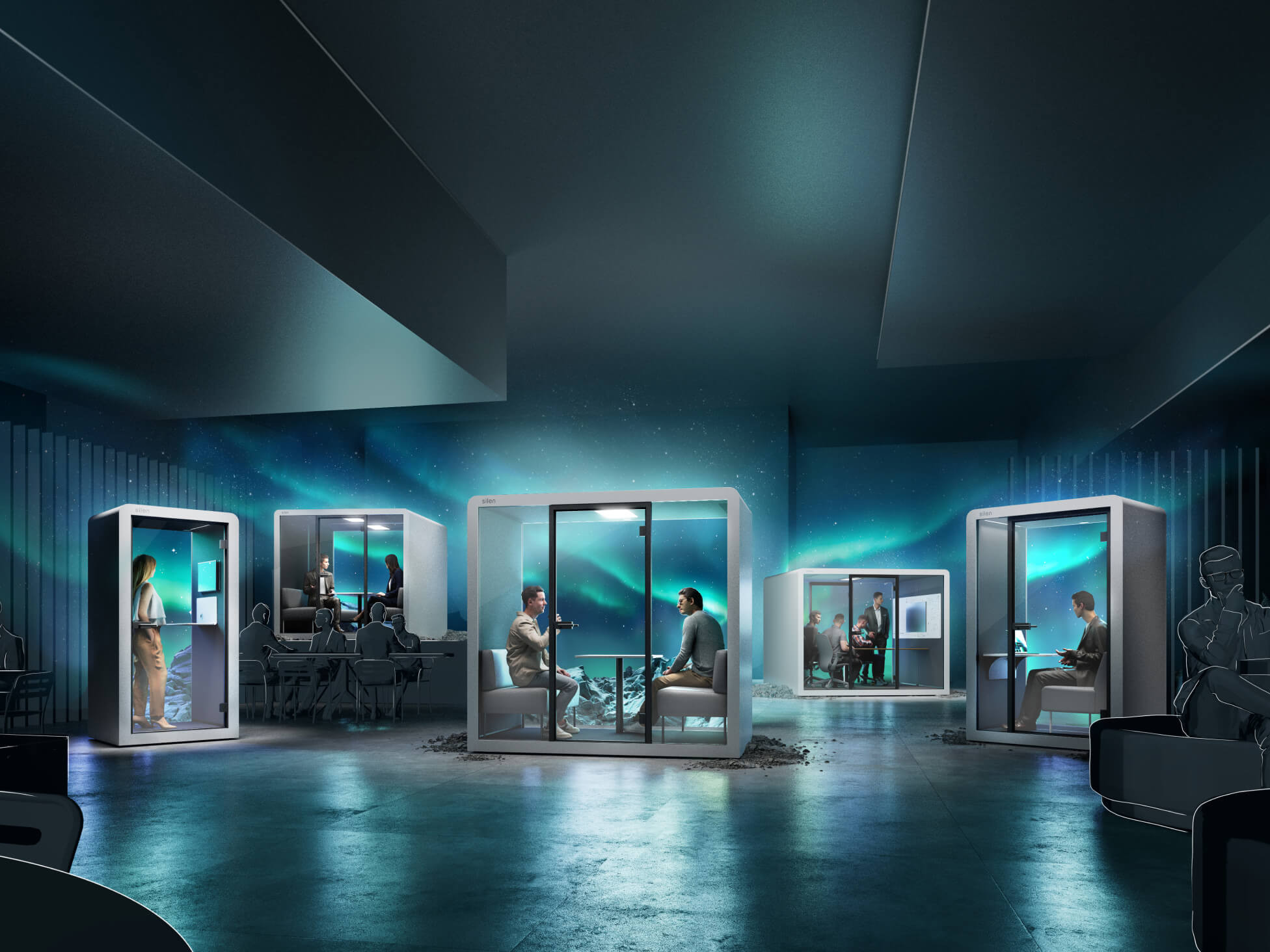
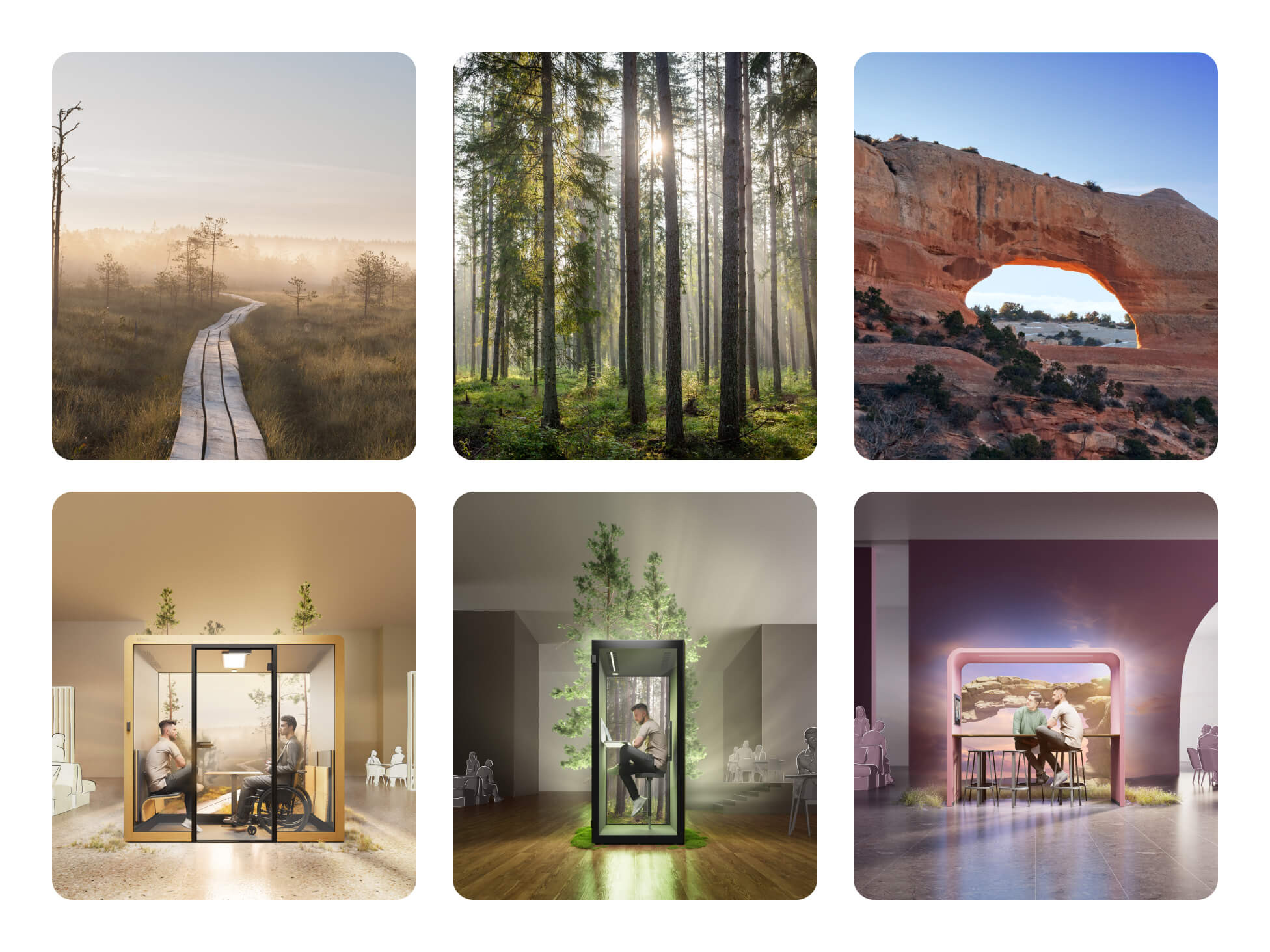
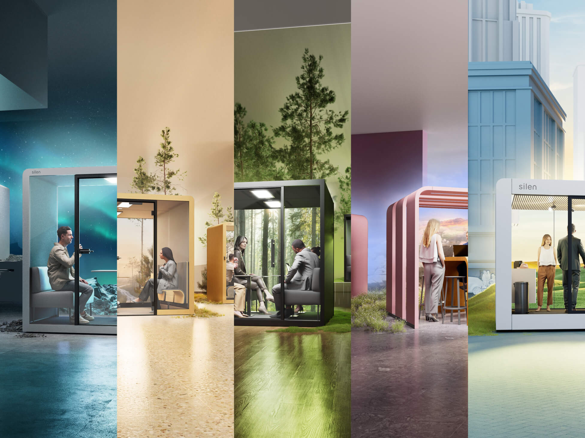
Each product line-up got its own creative visual theme which drew inspiration from nature and the outdoors. The concept is that Silen creates an oasis of peace in an otherwise noise-filled world. Imagine stepping into a Silen pod and you leave the distractions and noise behind you. You enter a world where there's peace and quiet and where focus comes naturally.
Design your own pod
The configurator was already an important part of the previous website and a tool for the sales team and partners as well. During this phase it wasn't meant to get a complete overhaul but rather we reviewed the feedback and tried to find a solution that creates the biggest impact with the smallest change.
We'd love to hear from you
Drop us a line —hello@dux.ee
Or give us a call
—+372 505 9146
