In 2018 we were approached by Cachet to help them visualise their idea of a digital service which enables gig-economy workers to get insured at a fair price and keep their data wherever they go. Little did we know that 4 years later we would still be helping them shape the gig-economy insurance field – and yes, that is a mouthful, but what does it mean exactly?

The landscape of employees has changed: more people want to be in control of their working hours, their work-life balance and a lot of new services – not to mention pandemics – allow or force them to pursue a lifestyle with which they can decide when, where and how they work. However, insurance is made for full-time workers and asset ownership. In other words, insurance companies are playing catch-up with people’s needs.
This is where the opportunity lies and Cachet comes in. The long term vision is to provide a service and platform that aggregates all the users’ insurance data in order to provide them with fair and flexible insurance pricing.
As their long-term design partner, DUX has been responsible for all UX/UI design for Cachet’s web presence and platform on top of creating the brand and visual identity.
Early visualisations of disruptive ideas as digital services

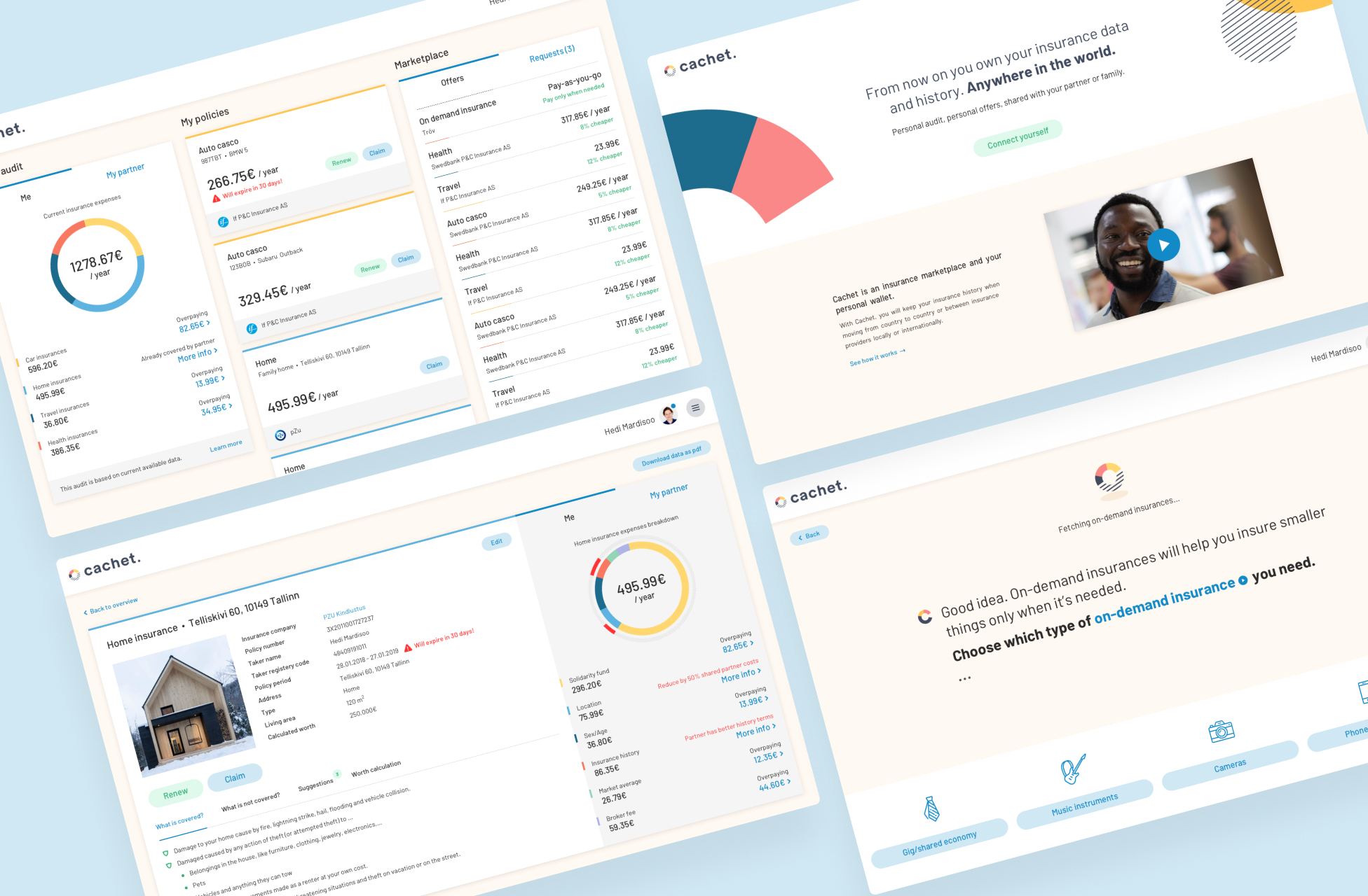
The early design explorations we created for Cachet revolved mostly about putting the broader concepts into an onboarding flow and a dashboard. These were meant to illustrate and sell the idea but also help validate the concept.
At the same time this is also when the brand itself started to take shape and although the logo stayed the same, the visual identity evolved at a later stage to what you see today.
Armed with visualisations of an interface and a service that looks like it already exists, Cachet could now move forward to validate their idea with industry experts and potential users.
It’s not a brand for an insurance company, it’s a brand for a professional lifestyle
The entire approach to branding Cachet was one of disrupting the preconceived notions of what type of company Cachet is. It’s easy to think of Cachet as an insurance company whereas it’s rather a company providing a service that allows gig-economy workers to work how they want to work, live how they want to live. In that sense Cachet is more Silicon Valley and less Wall Street and we wanted the visual identity to reflect this as well.

The Cachet Pattern was one of the first things we discussed together with the team. The idea is that a person’s pattern is created from their behaviour and history and this is what makes them unique and what helps Cachet create a personalised offer. Every person has a different pattern because everyone behaves differently and uses different types of services.
The logomark for Cachet came directly from the initial visualisations of the pattern. The wordmark is a customised version of the geometric typeface Circular and for the other communication we use TT Norms Pro, another geometric sans with a wide range of supported languages which makes it easily scalable.
For the colour scheme we chose fresh, vibrant and inclusive colours that can stand out from a sea of same-y insurance company logos.
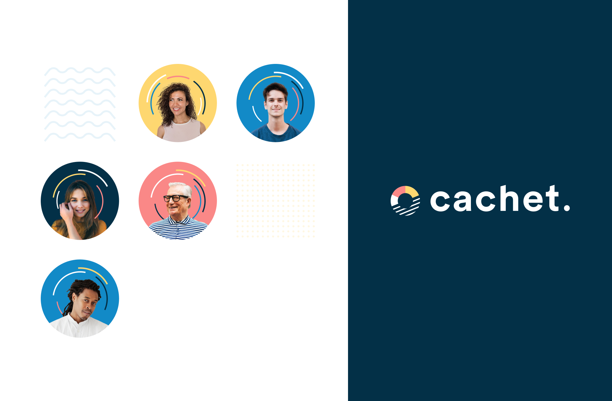
When working out the applications of the visual identity we went back and forth between using photos or illustrations. We decided to primarily use photos with the focus on people in order to create a credible relatability with the type of people who would be using this service. Spoiler: anyone can use it, from young to old, across all races and genders. The focus on people also helps establish one other principle, namely the user-centric nature of the service.
Purchase, claim, learn about your behaviour, adapt, get lower prices, …
Very likely you have – at least once in your life – purchased insurance. I think we can all agree that it is not the most exciting experience. And to be fair we can’t pretend like we can make it very exciting either. The sheer amount of data input required of the user is enough for anyone to roll their eyes and sigh heavily.
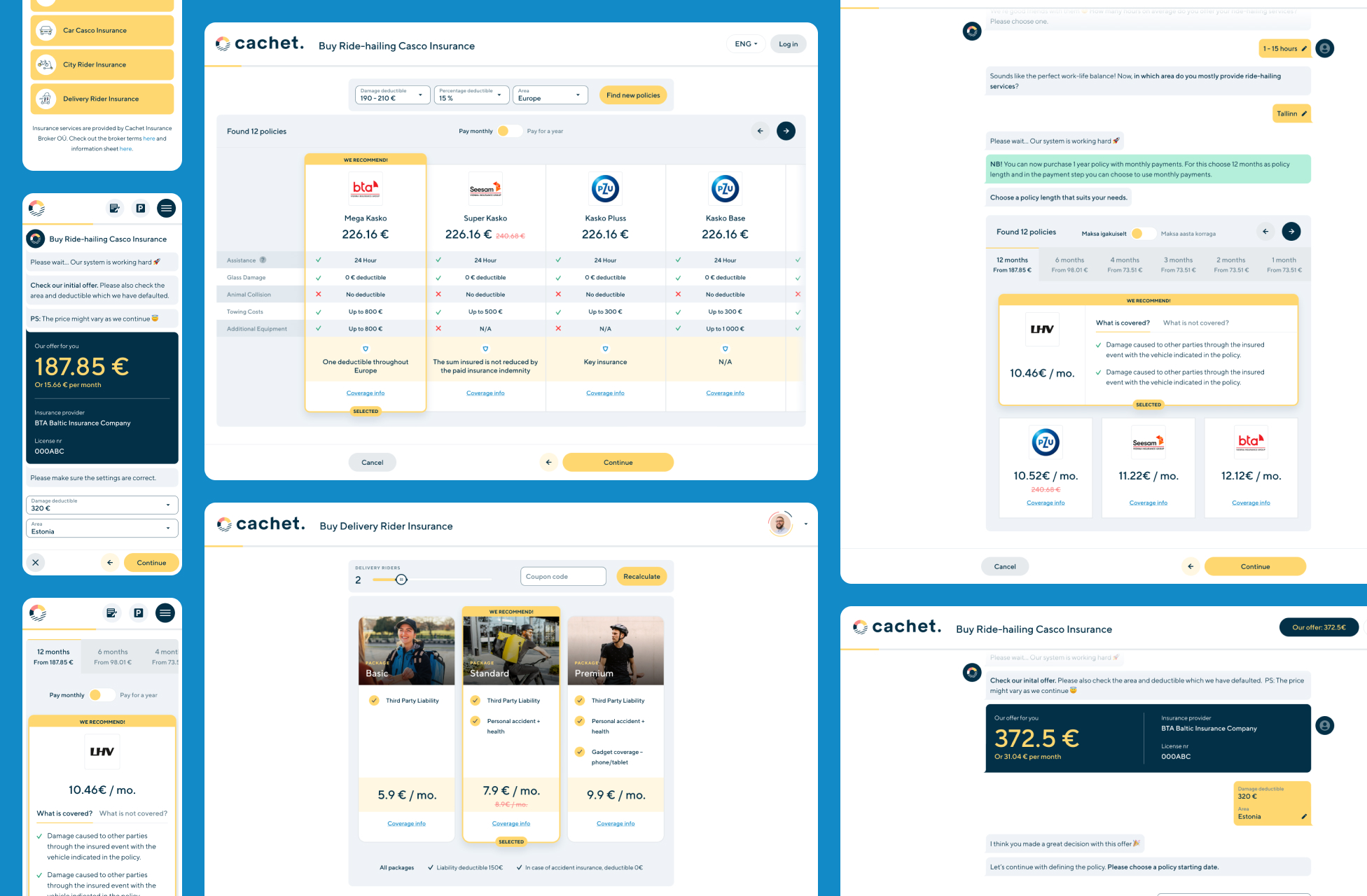
But what if we could try to make that process more engaging and personal. What if we could have a conversation with the user and get the data in a way that doesn’t feel like we’re just serving them a bunch of fields that need their input. And what if we could add some tone of voice into the process?
This thinking led us to the chat UI approach where we simulate the experience of a dialog during which the user shares the relevant information, but also where we can give Cachet a voice that speaks to the user and helps establish the brand tone.

The service Cachet is offering is centred around the user and their behaviour. For this we needed a good place where we could offer good insights and data to the user so that they would be able to understand and learn how they can influence their rates.
It’s important that we are not pointing fingers or using blaming & shaming in order to educate the users. We want to offer them the best possible information so they can get to the realisation themselves, which is definitely a better experience than telling them how bad they’re doing – no one needs to hear that from us.
The dashboard is the main communication tool to reach the user: it holds data on their behaviour and patterns, tips & tricks and insights into the habits of other people.
Moving forward
Cachet just raised 5.5 million € to expand across Europe. Their service will grow, new products will be added and new challenges will come. We’re looking forward to tackling them together with the team.
From the start Cachet recognised design as an integral part of their process and the value of bringing in a designer early on can not be overstated. DUX was responsible for the creation of all UX/UI, branding and marketing (sometimes even copywriting) from the start, and this responsibility creates a sense of ownership and involvement that we actively look for and thrive on as designers.
As digital services and products are never finished, we cherish the opportunities to be involved long-term and help companies from the beginning. It gives us an insight into a variety of interesting industries and ideas and for our client – or rather partner – it means a dedicated, experienced designer who is part of their team, working towards the same goals as the team is.
That sounds like a win-win situation.
If you want to find out even more, check out our Cachet case study or visit their website


