Coinmetro '2021
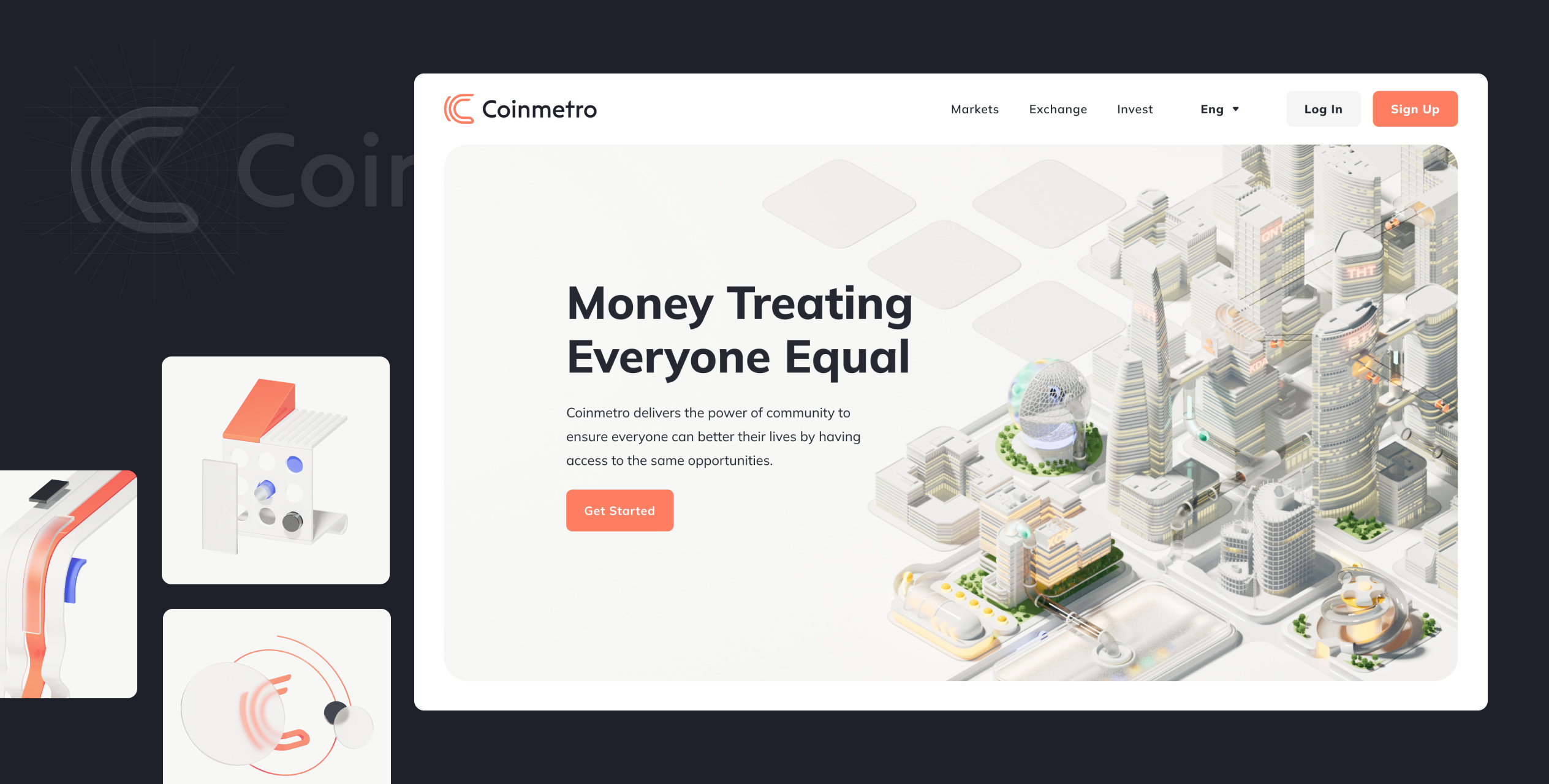
2022 marks the year that Coinmetro made a big redesign: Everything from the branding and visual communication to the UX/UI of the platform would be redone to better suit the company's growth and maturity.
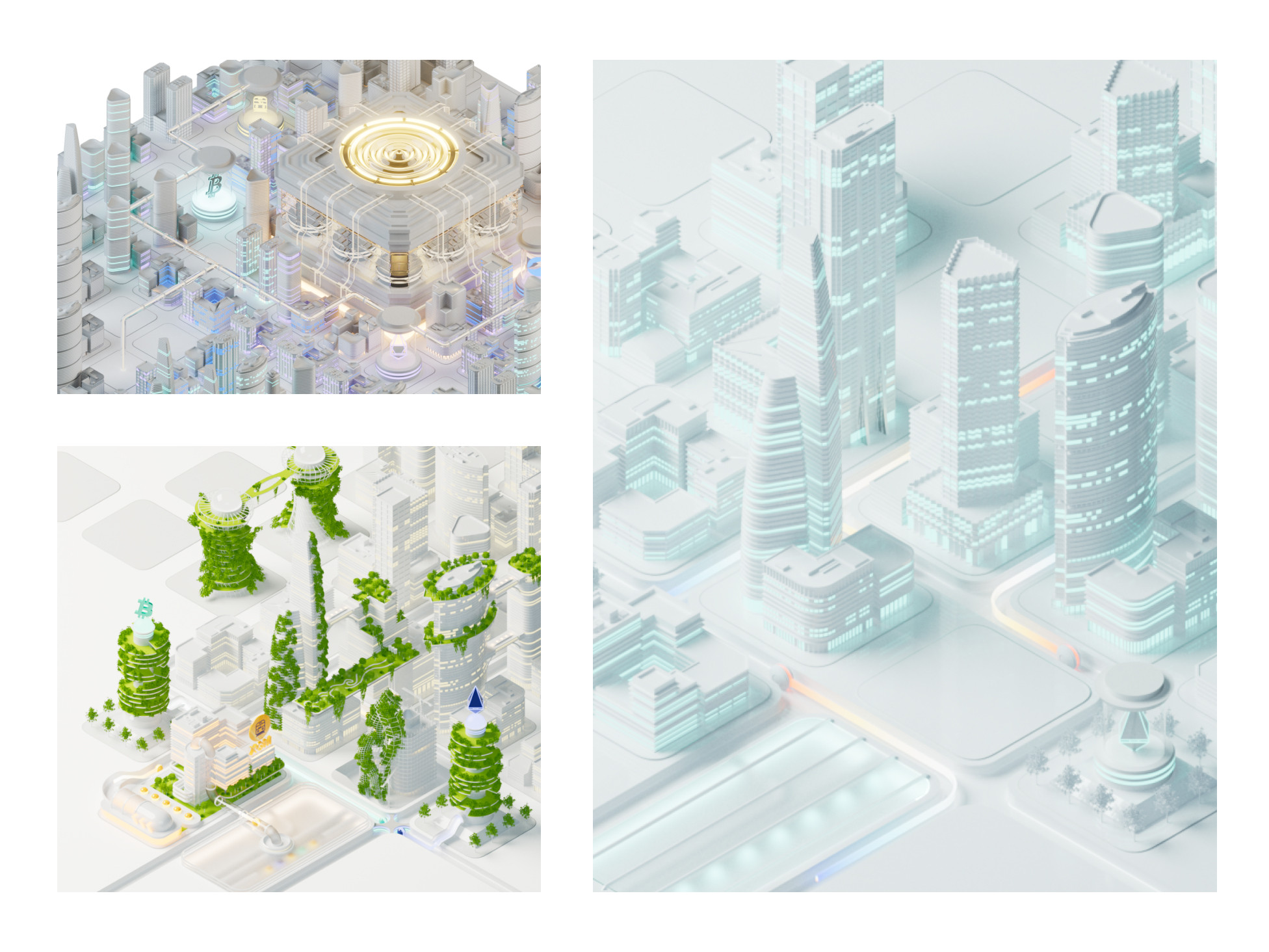
As long-term design partner, DUX was brought in for a unique opportunity: to create the new visual identity from scratch. Closely collaborating with their in-house designers, product owners and stakeholders, we delivered a fresh brand for both the company Coinmetro and their token XCM, accompanied with a new direction for the visual assets – shiny 3D illustrations.
Goals & Results
A new brand and visual identity that aligns with Coinmetro's new vision, including a library of new visual assets that can be used in their internal and external communication.
Partners
ORGO – Development
Visit
A new brand for a new vision
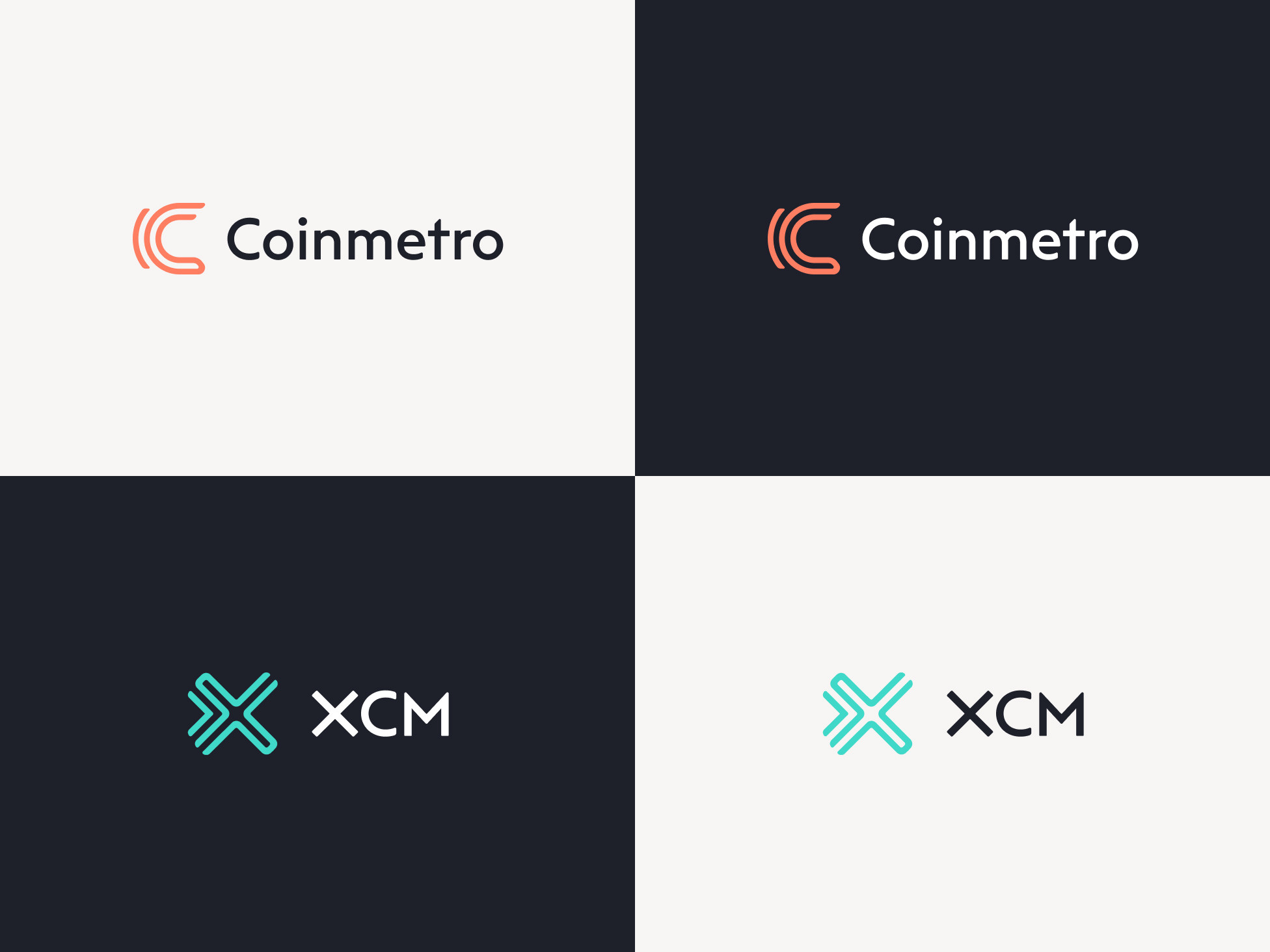
The goal for the logo redesign was to create an easily recognisable mark – clean, but elegant, and most of all – not a train anymore.
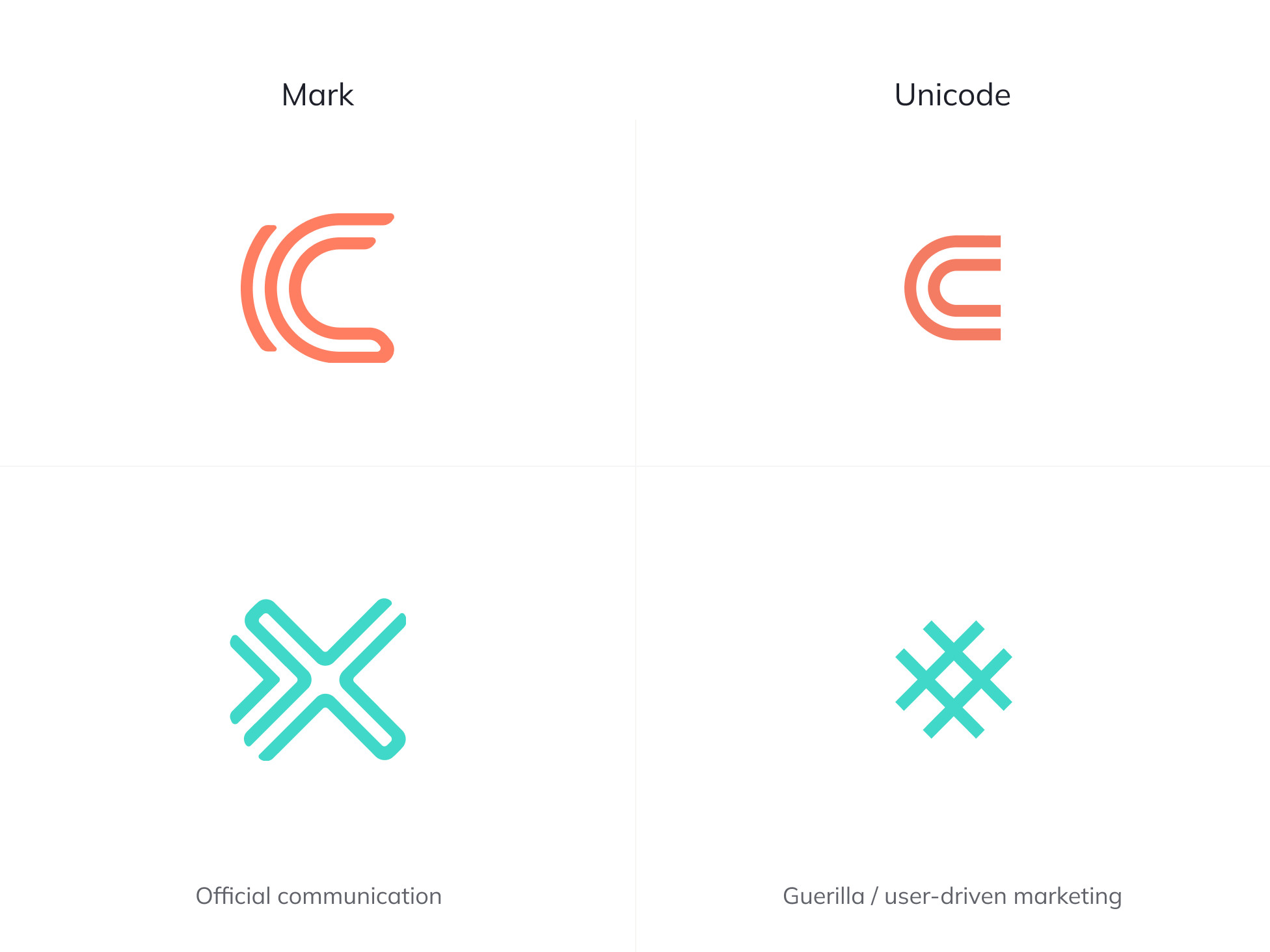
After going through different explorations we landed on a stylised version of the letter C, which also works great with a unicode character for user-initiated and guerilla marketing. We also created a new XCM logo to be a part of the same family, following the same design style we set for Coinmetro.
The Metropolis
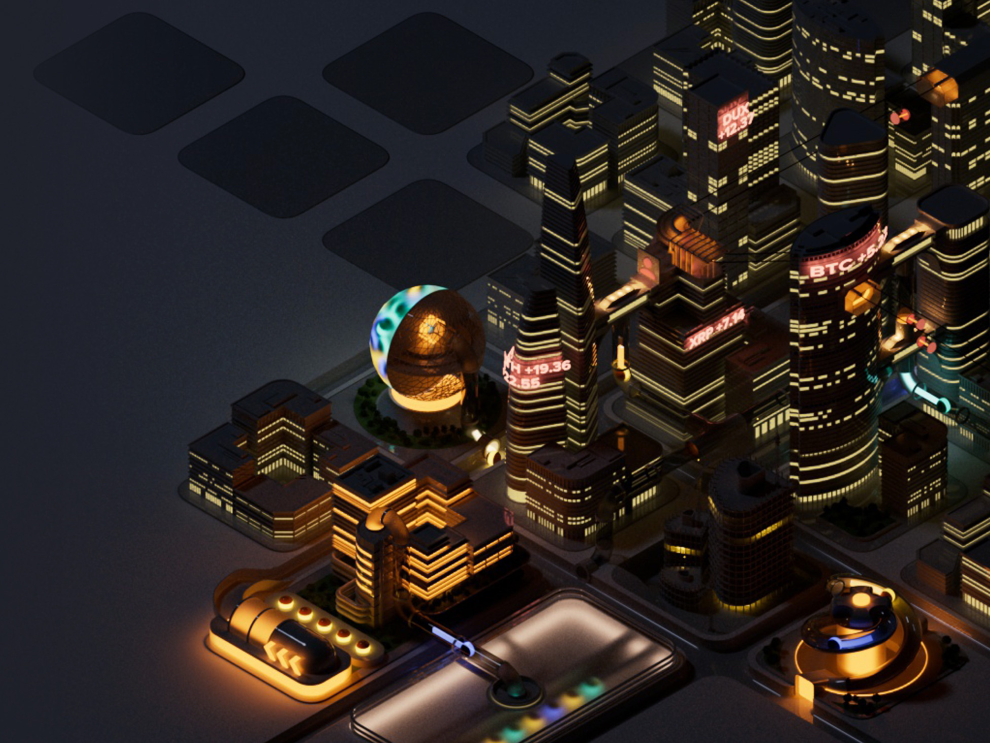
The Metropolis is a representation of Coinmetro's vision: a place where opportunity is accessible and markets are open for all. It's a bustling place where the community has a voice.
The cityscape went through a lot of iterations before we landed on the final version.
Coinmetro's Feature Buildings
The core features of Coinmetro have their own place and their own architecture within the city – There's the exchange platform, the crypto assets, the opportunity to copy trades and the XCM powerhouse.
Databank of visual assets
On top of the Metropolis visuals we also created a databank of visual assets that they can use, whether it's for e-mails, blog posts or banners. These assets give their marketing team the opportunity to create great visuals for their external communication.
We'd love to hear from you
Drop us a line —hello@dux.ee
Or give us a call
—+372 505 9146
