Public Transport Ticketing — Designing white-label mobility products for Scandinavia and the Baltics
Public Transport Ticketing '2019
A cooperation spanning 5 years, we were Ridango's UX/UI design partner, responsible for the design of their public transport ticketing platform offering on web and mobile apps.
Effectively, being a part of Ridango's team, we developed the logic, user experience and design systems created for several client web platforms and mobile applications. Some of the services included account-based ticketing (ABT), automated fare collection (AFC), real-time passenger information (RTPI) systems and more.
Partners
Ridango AS – Product Owner & Developer
Singleton – Mobile App Developer
Design goals
To design a unified logic and user experience for a complex public transport ticketing system which Ridango can offer to different clients. To come as close as possible to a one-size-fits-all solution.
B2B customers and platforms
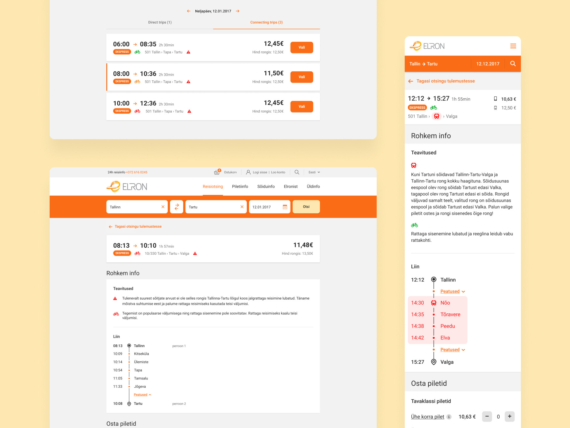
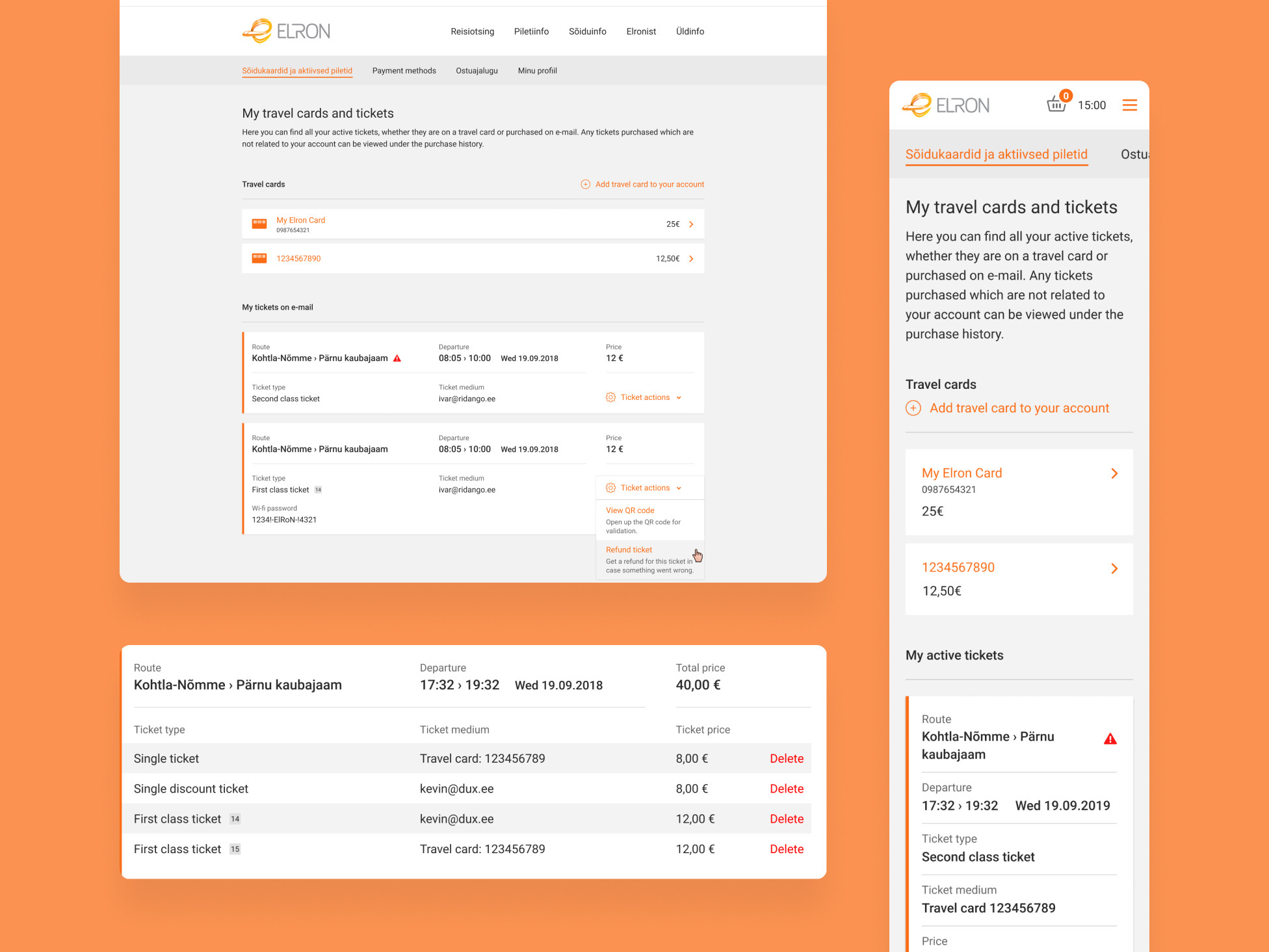
Elron AS in Estonia – Ticketing platform for trains
Elron AS in Estonia – Validators in trains
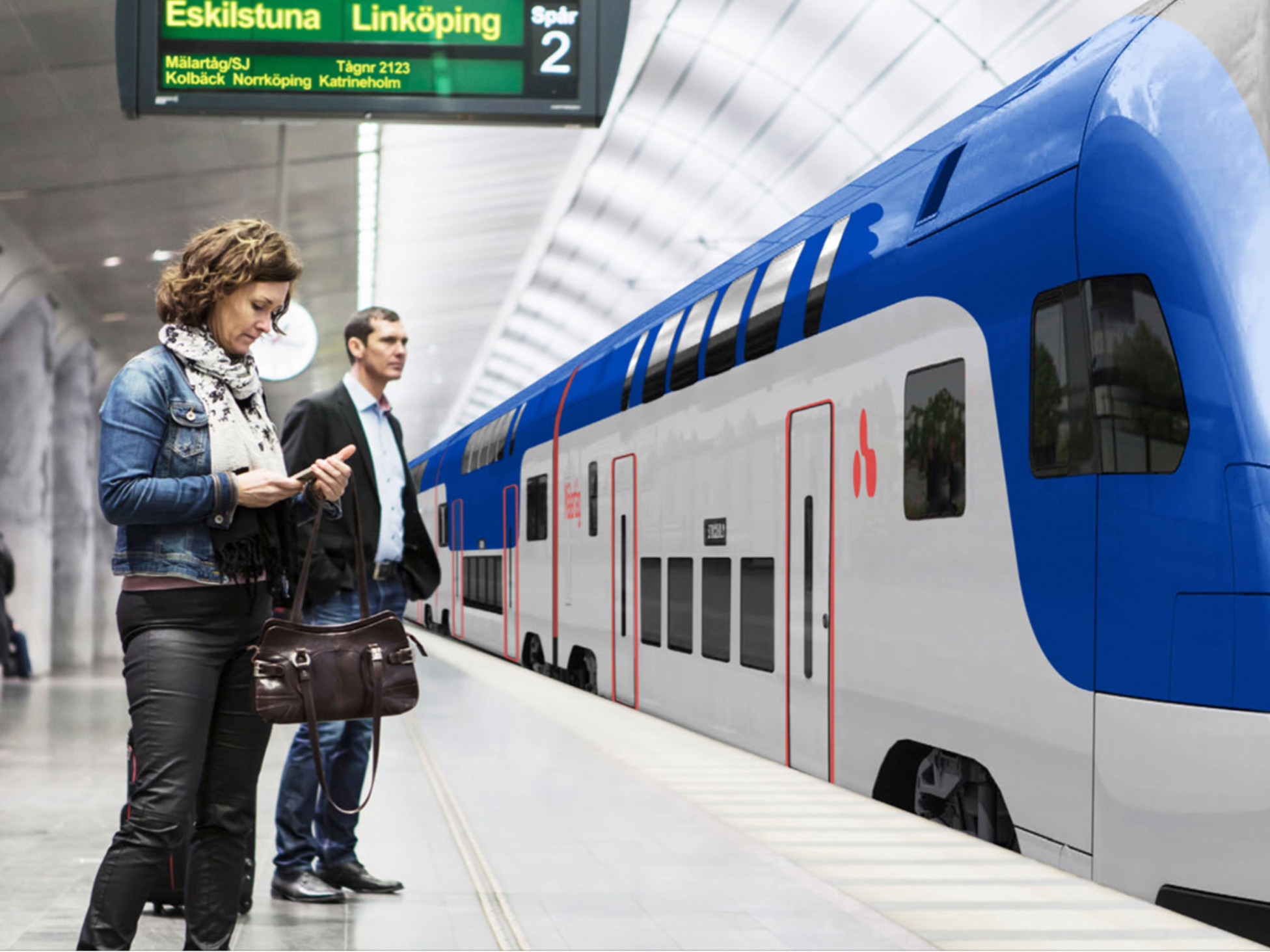
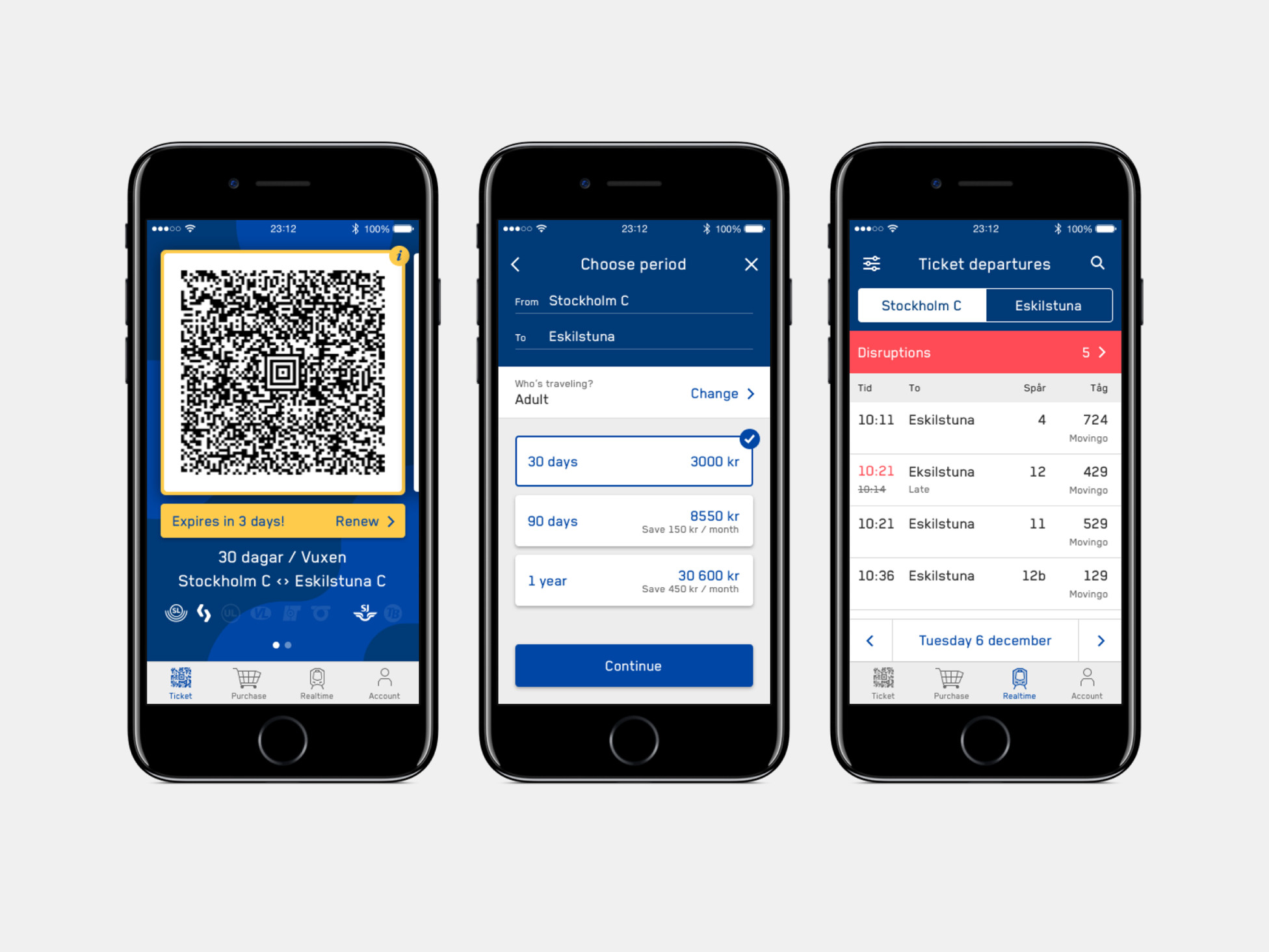
Movingo in Sweden – Web & mobile app
Pilet Mobile App in Estonia
Sörmlands Trafiken in Sweden – Ticketing Web Platform
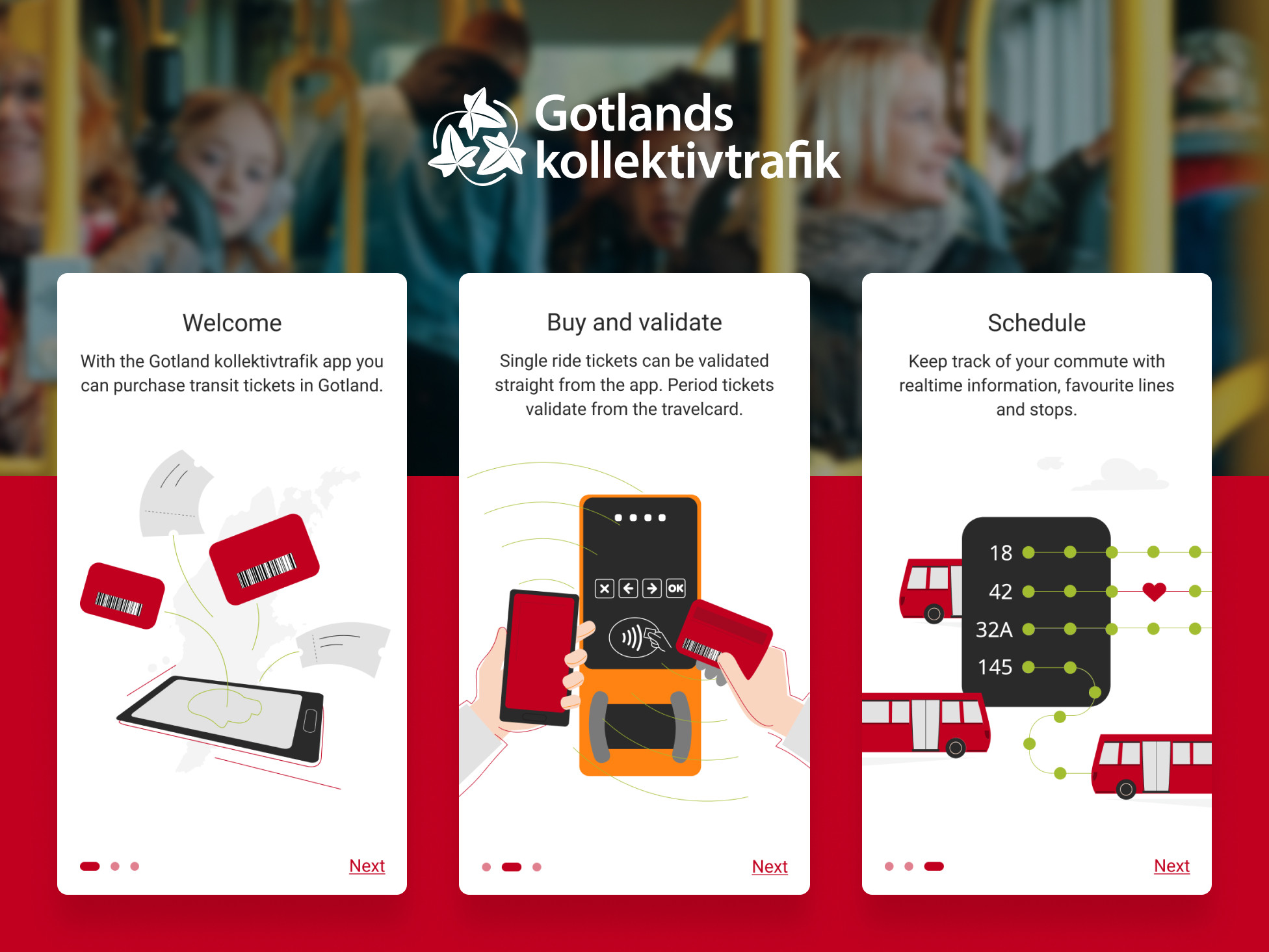
Gotlands Kollektivtrafik in Sweden – Ticketing Web Platform & Mobile App
Klaipėdos keleivinis transportas in Lithuania – Ticketing Web Platform
Imatra in Finland – Ticketing Web Platform
Awards
Estonian Design Awards 2019 – Silver
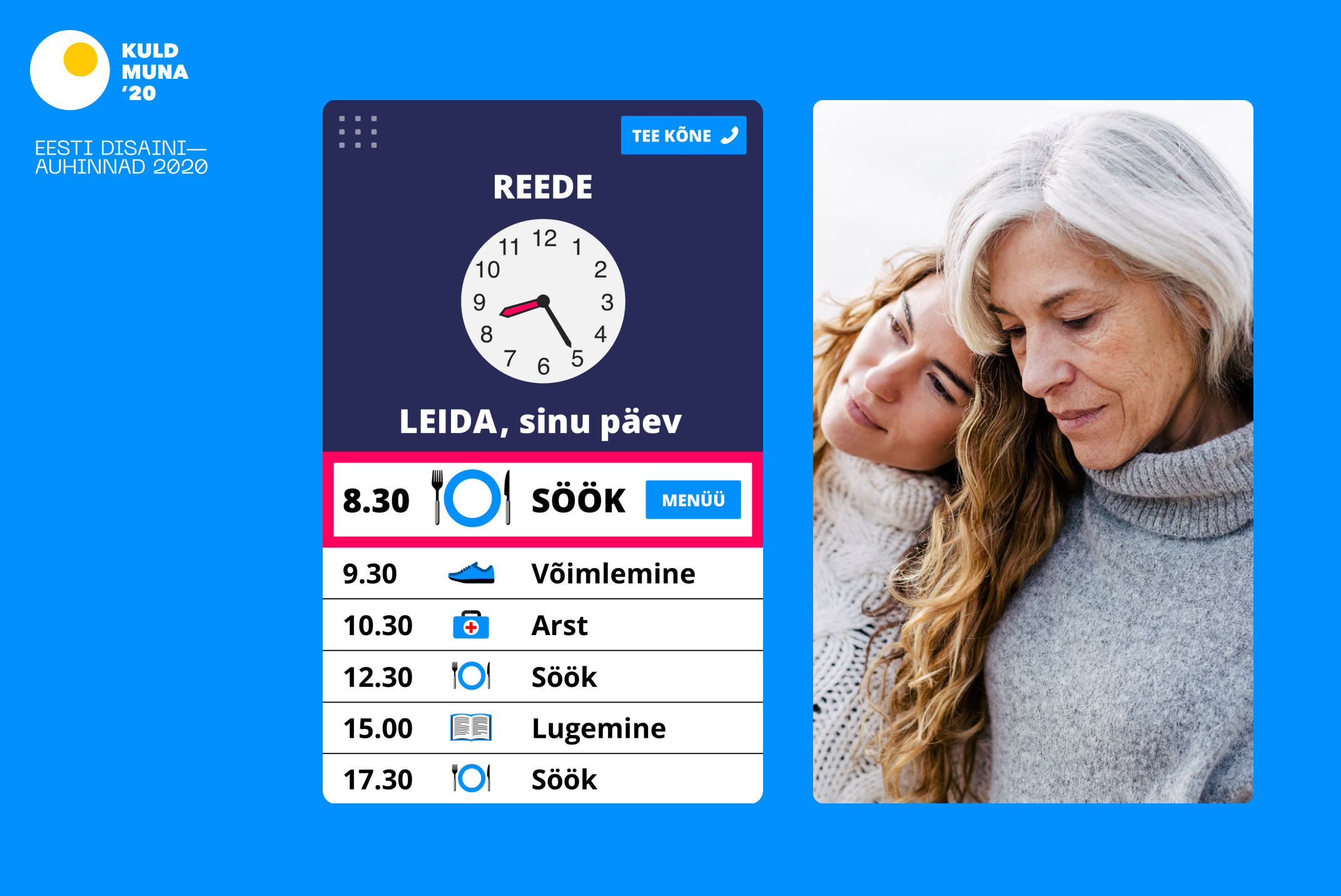
Golden Egg Awards 2019 – Special Prize
Laying the foundation with Estonia's national passenger train operator
Our first task was going to set the foundation for the new UX of the ticketing platform. We couldn't build something new from the ground up, but rather we had to get familiar with the history of the existing solution and how the business rules and technical setup would shape the design.
The main aim, however, was still to improve the UX and increase the retention and online ticket sales on Elron's website.
User interviews & Testing in Stockholm
When designing the Movingo mobile app solution we had already gained a lot of knowledge of how Ridango's product works. This was a perfect time to gain insights into what the user wants from a mobile app, considering additional features (like a realtime timetable) would be introduced.
After the first user research round we created a clickable prototype and went back to Stockholm to test the new features on travelers in the train station to have the most realistic context.
Designing a white-label solution
The interface design had to work on a lot of levels. It had to be flexible and neutral enough so it could work for different public transport providers across different countries. It had to be accessible for a wide range of users, young and old. It had to work within the existing business rules and technical setup.
Therefor it was important to construct a neutral design with a defined design system so that when there was a new client, we could easily take the latest iteration and translate it to the client's brand and specific needs.
Testing & Iteration
As these platform needed several rounds of testing we divided them to pre-live testing on UI prototypes and testing in demo live phases plus we tested some interactions on live products but in a design prototype. All had different format and aims, but all were necessary to test out such a heavy load of users traffic products.
Through iteration we also managed to improve the product UX and UI with every step, with the possibility to expand on earlier ideas that needed more time to grow.
On-Demand Dispatcher Tools
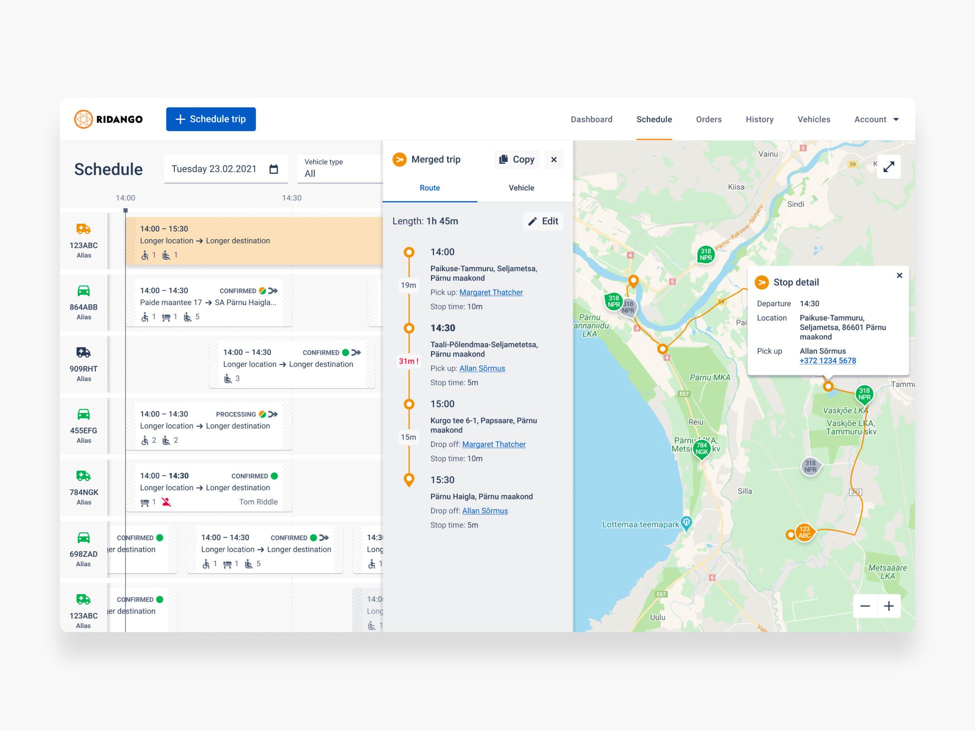
The need for on-demand is growing and this project was the perfect opportunity to work out how on-demand public transport could look like – at least from the dispatcher's point of view. The scope of the service was specifically targeted towards local municipalities, but also private companies, that provide the on-demand service to elderly and people with disabilities.
The dispatcher usually gets a call – since elderly feel more familiar on the phone – and then they have the duration of this call to get all the information needed to schedule the trip. They have an option to merge trips in order to create a more efficient route. And all of this is relayed to the driver's device.
Physical touch points – Validators & Airport Kiosk
During our cooperation there were several projects that took us beyond our experience with web and mobile, and that got us more familiar with physical devices and how to design with them in mind.
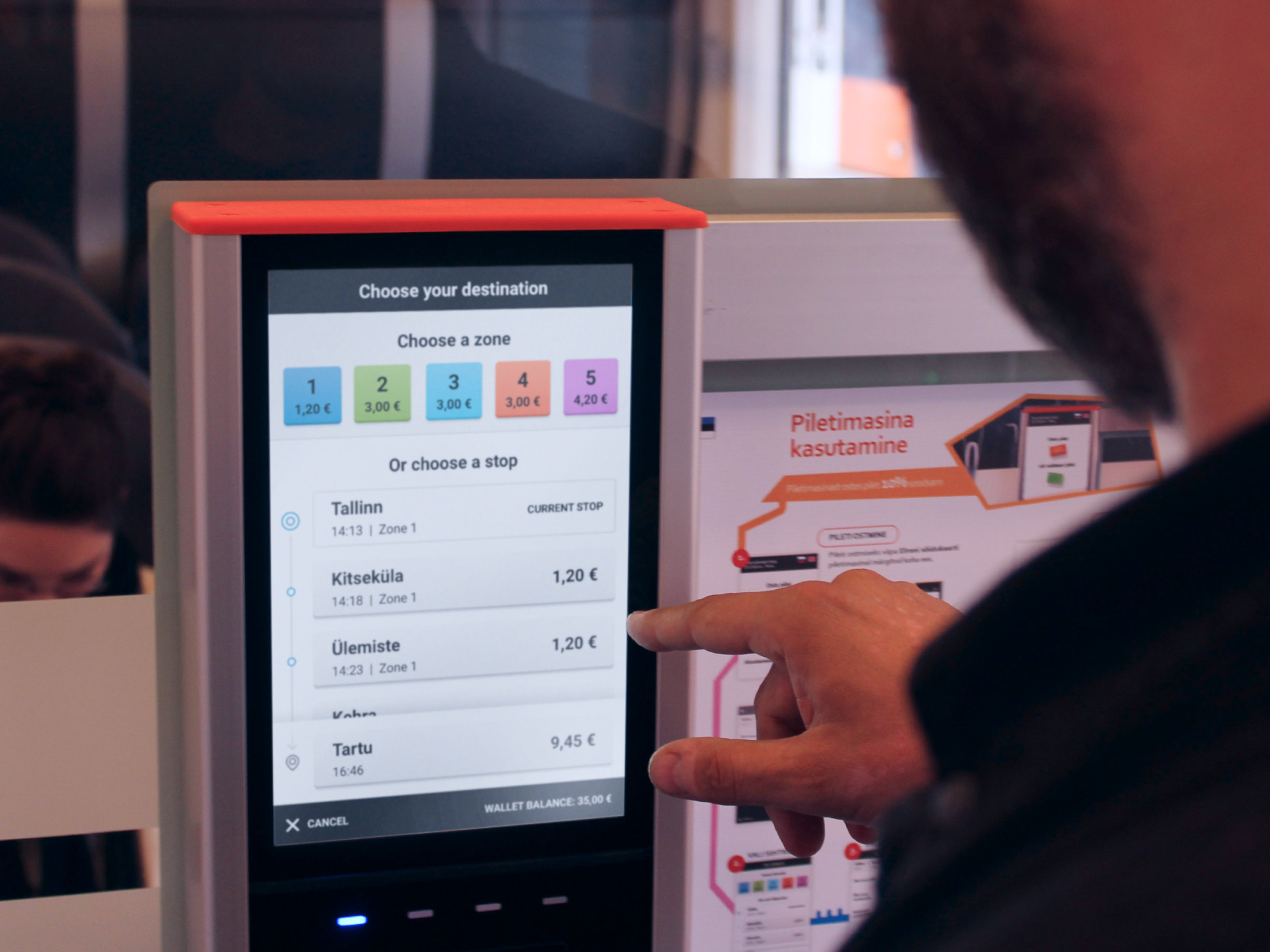
For validators and self-service kiosks, context-awareness and speed are key, so we designed clear and easy flows that bring the user straight to the point. As seamless as possible, while still providing extra value, the validators and kiosks are now still in use by the passengers and tourists.
We'd love to hear from you
Drop us a line —hello@dux.ee
Or give us a call
—+372 505 9146
