E-Estonia Briefing Centre '
e-Estonia inspires global policy makers, political leaders, corporate executives, investors, and international media with the success story of e-Estonia, guides them on the digitalisation paths and builds links to leading IT-service providers. DUX part was to create new website UX&Ui design but also set together with client the communication of the story and structuring of content.
Goals & Results
Create new website logic and design with a more clear communication of Estonias digitalisation story and centre services.
Partners
Developer - gotoAndPlay
Visit
Research & content strategy
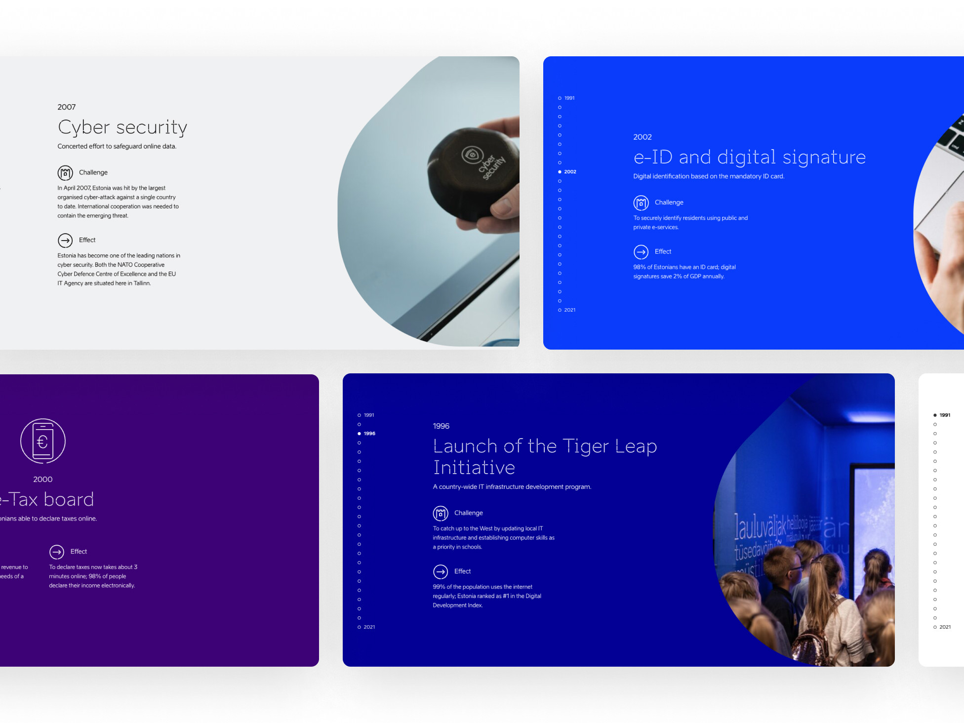
To understand the user's point of view and their needs, we conducted interviews with e-Estonia's target groups. Based on these results we made the decision to unveil the story of Estonia's digitalisation path in detail and as a visual presentation.
We made a lot of changes in how we present the structure and the content in other sections of the website. The client rewrote 80% of the website's existing content.
Low-fidelity wireframing
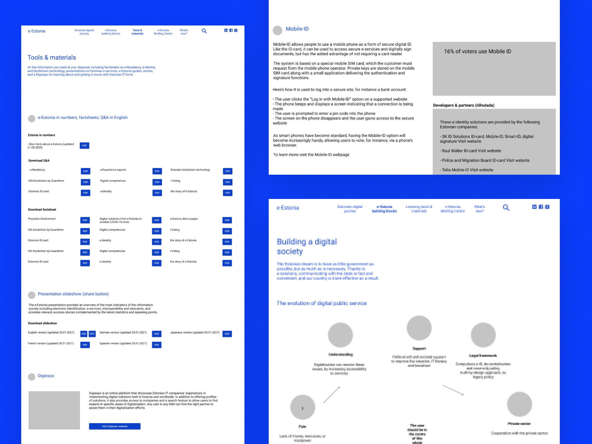
To see the new structure and content in action we first created a wireframe. During this phase new thoughts appeared and the content went through a couple rewrites. Through iterations and hard work we reached an agreement on the final version of the website's logic and content blocks.
We decided not to conduct user tests with the wireframe, but rather with the actual visualised design. Since this is a story based solution, we felt it was vital to test it in its visualised form to see whether users connect emotionally to the narrative.
Estonian brand guidelines
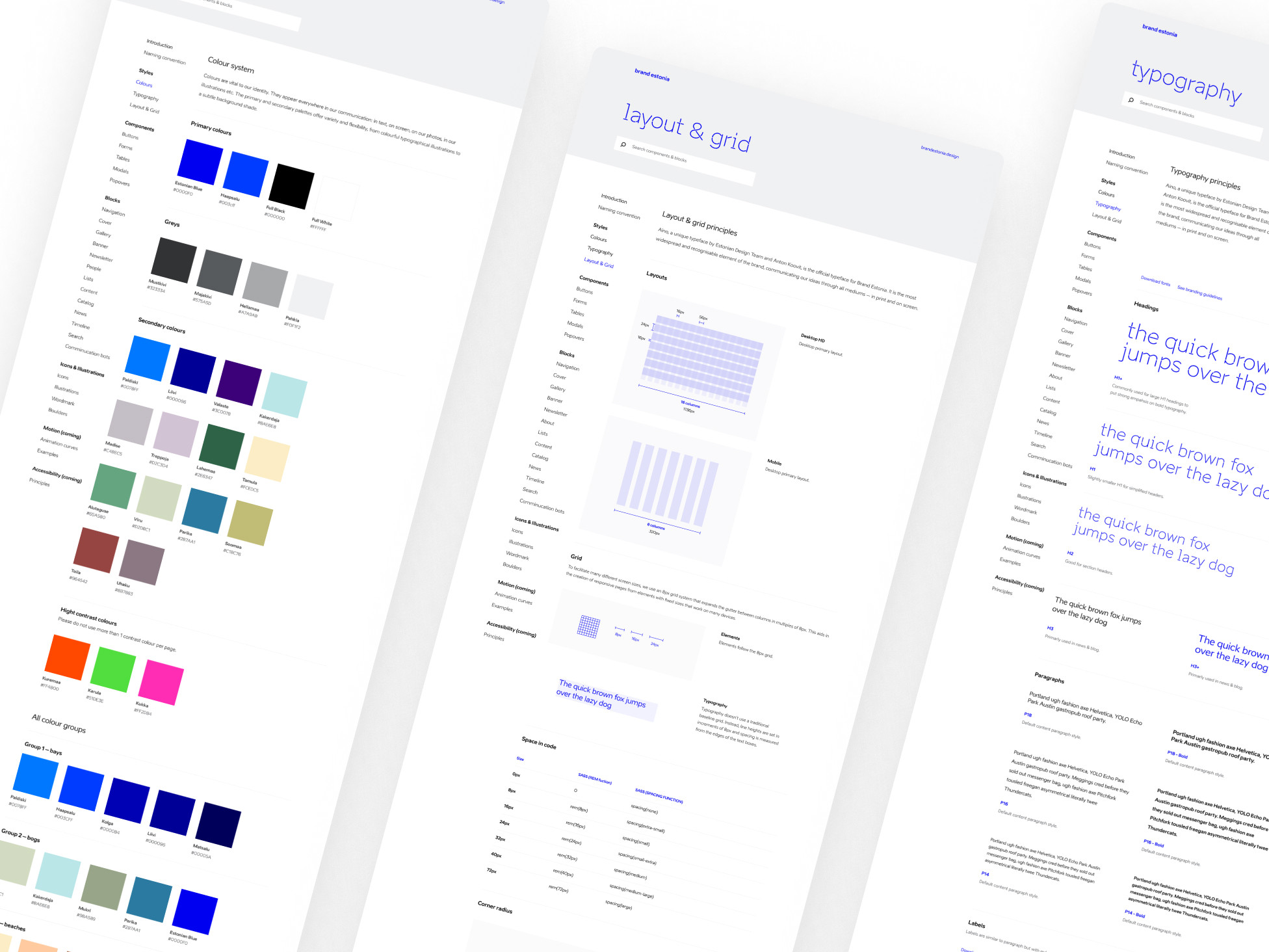
Estonia provides branding guidelines for presenting Estonia in external and internal communication. For the visual design of the briefing center we also followed these guidelines.
You can check them from here. We took these guidelines one small step further in how to interpret and develop them. Big thanks here to the Brand Estonia team.
UI visualisation & user testing
After creating the visual design for the UI with all the elements and responsiveness logic, we started to test our design solution on users. We created scenarios, found people, conducted interviews and user tests based on our UI prototype.
With the user testing we validated the main design concept and discovered some small details about user navigation paths. These findings also triggered some rewrites in site content, but in general our work was validated. We were good to hand over our design to the developers at gotoAndPlay and work together with them to deliver a fully functional website.
We'd love to hear from you
Drop us a line —hello@dux.ee
Or give us a call
—+372 505 9146


