Terviseportaal (Health Portal) — public gateway to people health data & services
Terviseportaal (Health Portal) '2024
Terviseportaal is the main digital gateway to people's health and medical data and services. This is the platform which brings together all health & medical related services that the Estonian public sector is offering towards the people, like doctors prescriptions and appointments, test results and examinations, screenings etc.
A service like this is a massive undertaking to redesign and develop, so a team of 4 different partners was formed to see it come to fruition. Our responsibility was not only to create a better user experience, but also to design a new identity for the platform.
Client & partners
Client: TEHIK & Tervisekassa
Partners: Iglu (design & development), Industry 62 (development), Snowhound (development), Dan Mikkin (brand communication)
Visit the platform
Terviseportaal.ee (platform opens after log in)
Awards
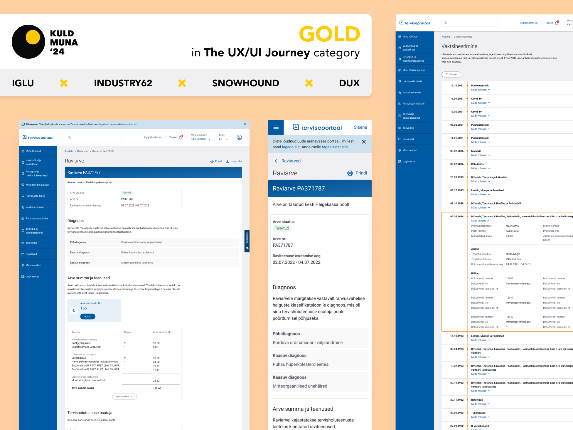
Golden Egg Awards 2024 – Gold in User Experience category
The beginnings
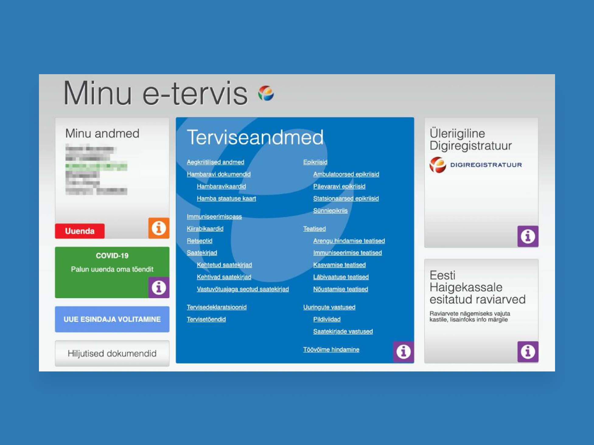
The team started this project with the aim to completely redo the old platform formerly known as "Digilugu". It was created ages ago and the user experience of the platform was strongly criticised. The team's task was to create a better user experience but also from the technical side to rewrite the old code base and logic to a new modern approach, so the platform could be more adaptable to future adjustments.
The brand identity & communication
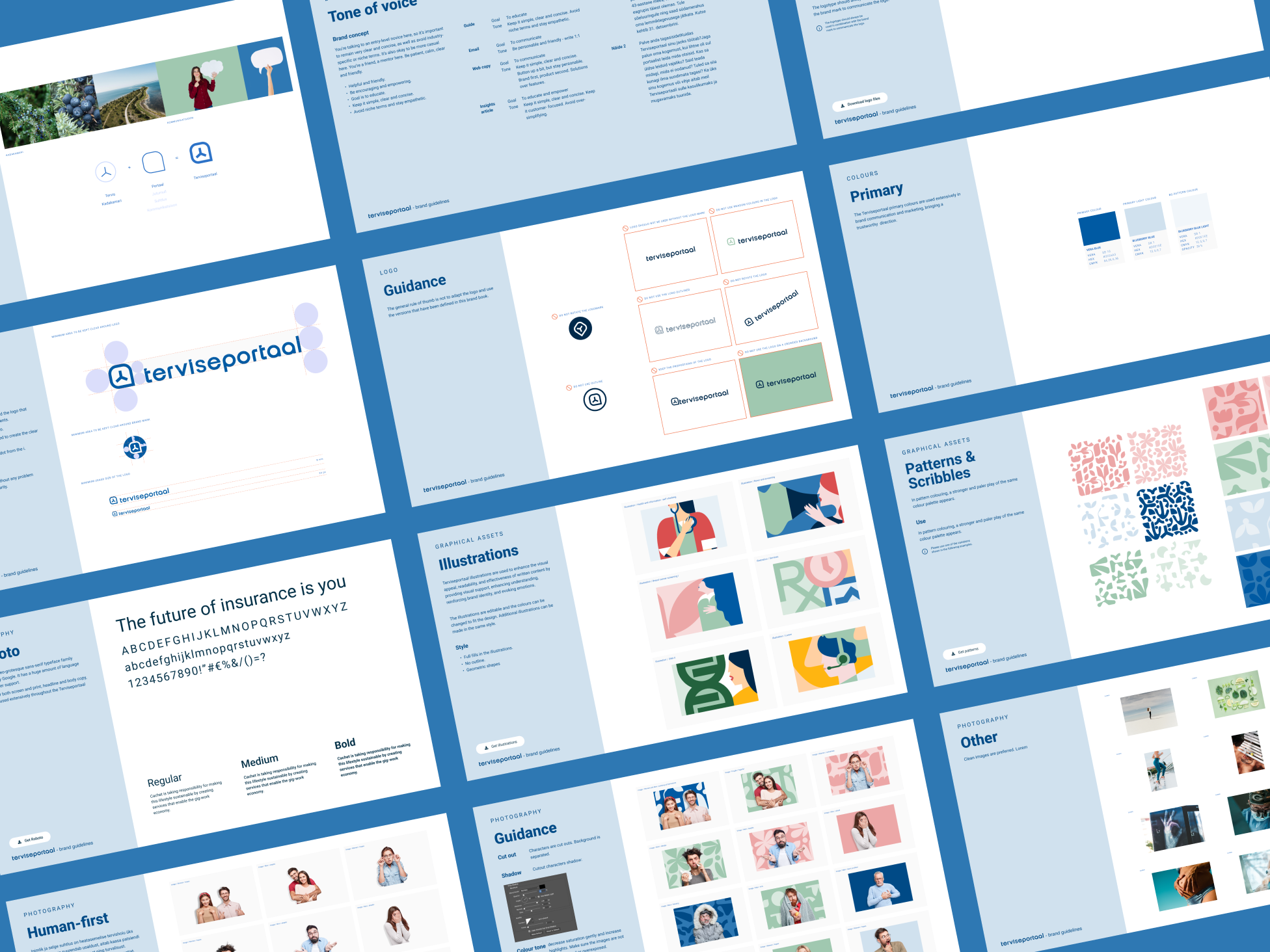
Early on we agreed that to get a new platform out we also need a new approach in identity and not only from the UI perspective but visual communication in general. During the project we created a new brand identity to the whole service. It started as "let's make a logo" to a proper brand identity with a new communication bases approach.
The platform UX & UI
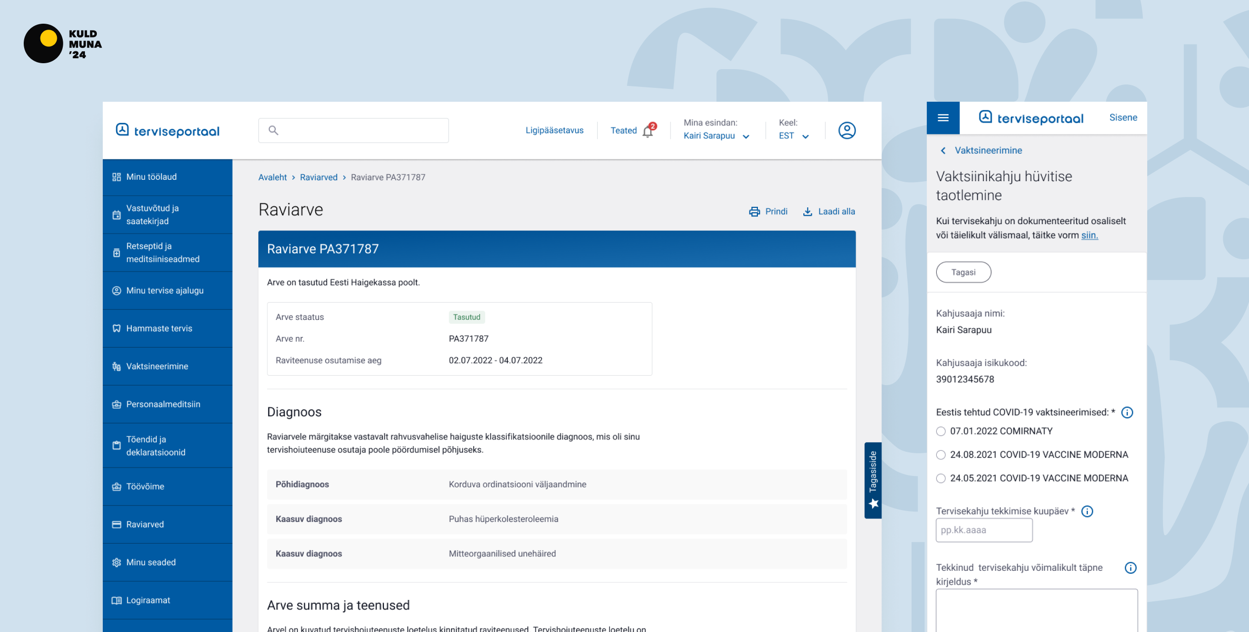
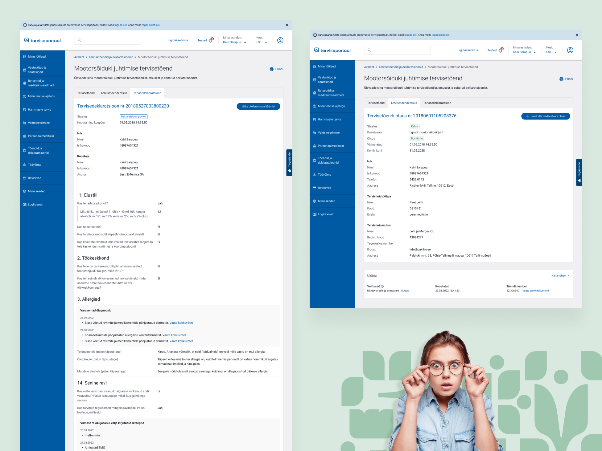
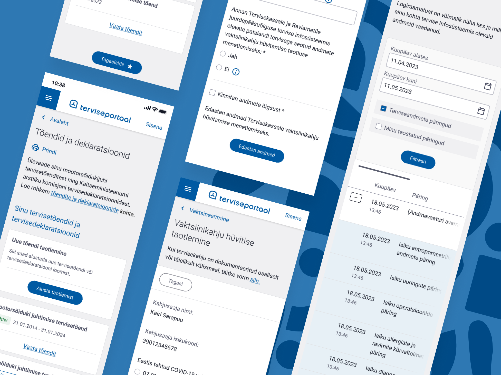
Together with the IGLU design team we created the platform's new interface. The main challenge for us was to take the old functionality and data and design it with better UX, considering that we also needed to adhere to the VEERA design system, which is the framework for all Estonian Government digital platforms.
The feedback
During the project we ran several user testing sessions for every service using designed prototypes. We got initial feedback from users to be sure that what we are developing sees to their needs and wants. After the platform went public, we saw that people understand the logic, navigation, can find topics and interact with the service.
We got a Golden Award from the Estonian Golden Egg design competition for this project in the User Experience category. That was like a cherry on top for us ;)
We'd love to hear from you
Drop us a line —hello@dux.ee
Or give us a call
—+372 505 9146
